New Year, New You? 8 Inspirational Resolutions for Architects in 2024
CategoriesArchitecture

New Year, New You? 8 Inspirational Resolutions for Architects in 2024

The latest edition of “Architizer: The World’s Best Architecture” — a stunning, hardbound book celebrating the most inspiring contemporary architecture from around the globe — is now available. Order your copy today.  

The story of the New Year’s resolution began over 4,000 years ago in ancient Babylon. From what we know, at the end of each year, the pious and virtuous, polytheistic Babylonians made promises to their various gods, pledging to settle outstanding debts and return any borrowed goods. It was their way of starting the coming year on a right and moral footing.

Our reasoning for making resolutions might not be as serious as returning your neighbor’s grain barrel before you curse your crops for the rest of the year; however, four millennia later, the purpose remains true. Bringing in the new year always feels like the right time to cast off old habits, reset and wipe the slate clean as best we can — I’m pretty sure the Babylonians could have related to that phrase, actually.

New Year, new you? Well, no, probably not. New Year, a slightly improved you? We can get on board with that one. So, recognizing that we are not Bablyonians and that resolutions no longer need to be life or death, Architizer has outlined eight manageable resolutions that employ minor changes that will hopefully inspire you to make the most of 2024. They might even make you a better architect if you’re lucky.


Read more.
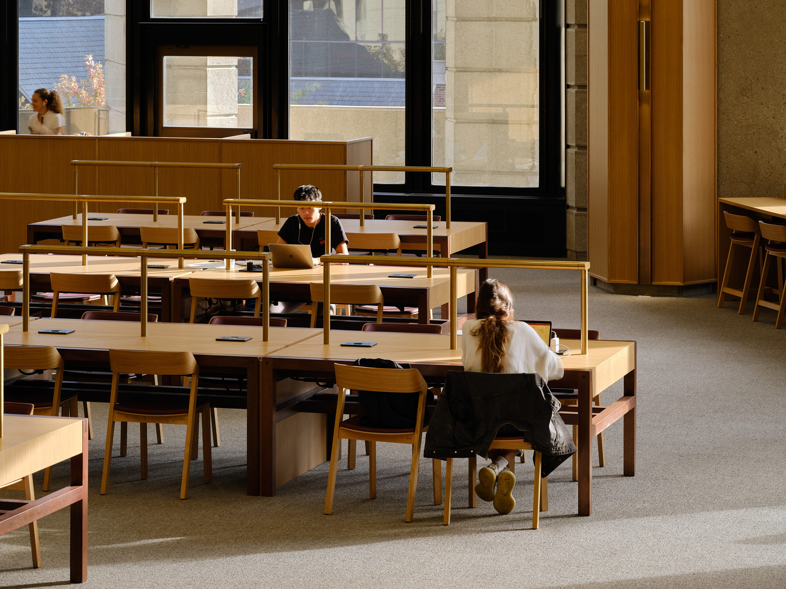
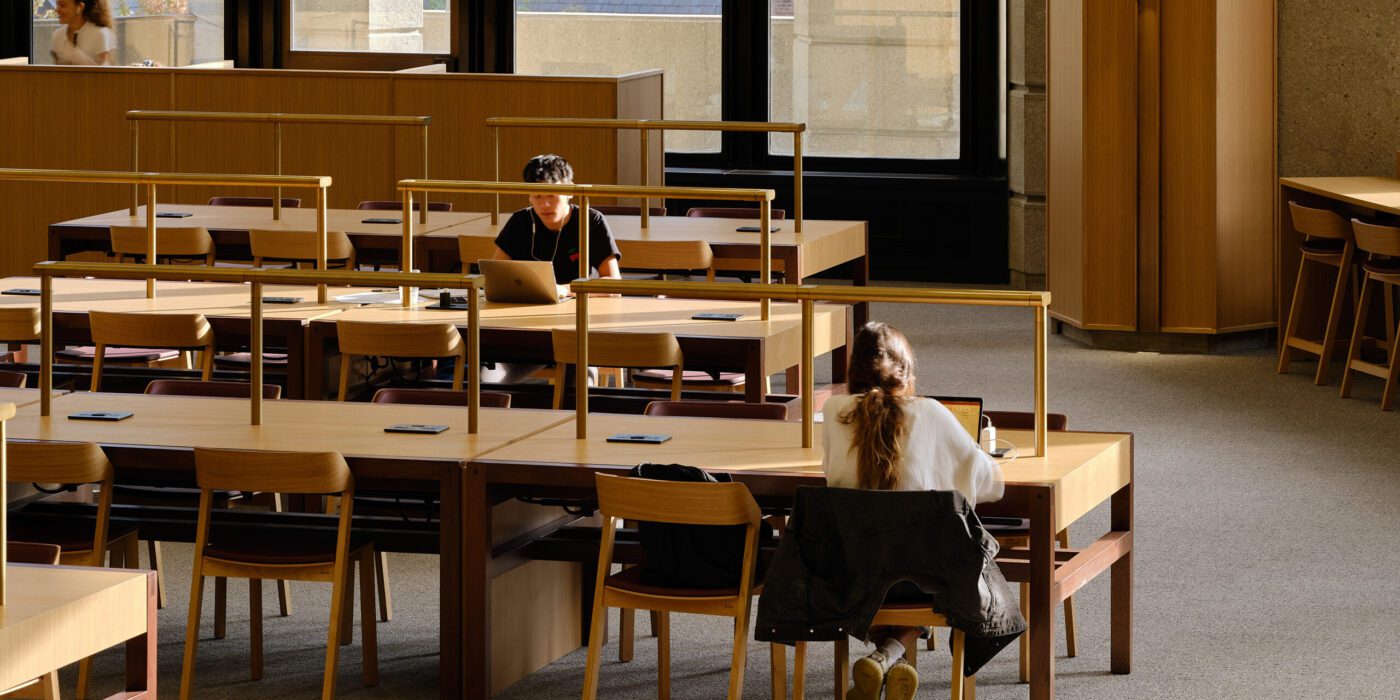
Robarts Library Reading Room by Superkül, Toronto, Canada Photograph by doublespace photography inc. Jury Award Winner, 11th Annual A+Awards, Institutional, Educational Interiors

Of course, you cry with a big eye roll at the lack of inventiveness. Wait —hear me out. Don’t close your tab just yet. There’s a reason “read more” is one of the most common resolutions people make. It’s because we never, ever, stick to it. We all read so much every day, but unfortunately, I don’t think Instagram captions and TikTok text overlays count. So here we are again: “2024 — Read more” (you can’t deny it’s got a ring to it).

We all know knowledge is the key and all that, so this year, why not try a different approach; what about starting or joining a book club? You could even focus it on architectural books if you wanted to double down. You could switch it up, a technical, a historical, and then a fictional, to stop things from getting too repetitive. You could choose to host it at your local library; they really need support, and they were literally made for book clubs, so it’s a win-win. What’s more, it’s my understanding that book clubs have biscuits, so what’s not to love, really?


Draw more.
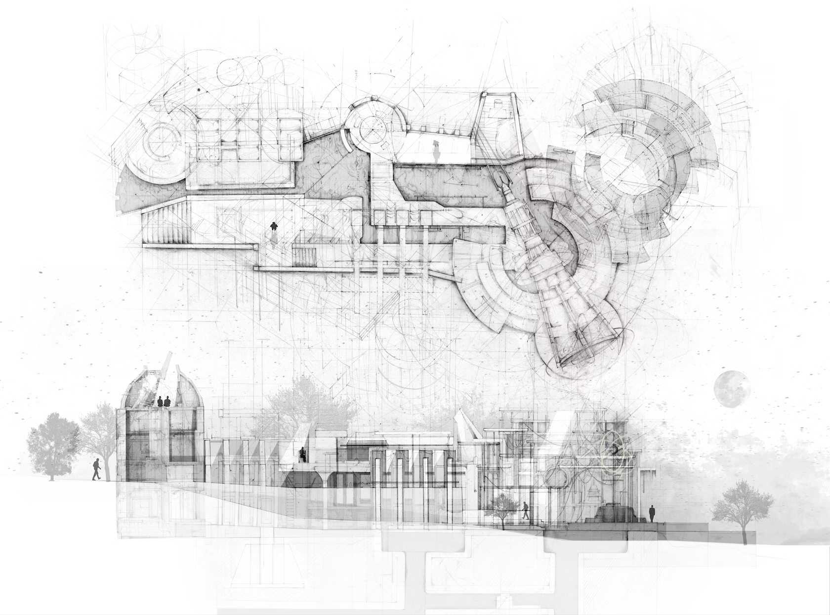
The Last Resort by Nikhita Sivakumar, Student Winner, A+Vision Awards 2023, Drawing, Hand Drawn Drawing.

This is one for the people whose sketches look more like Minecraft models than multi-lined masterpieces.

Sketching is a skill; yes, some people are naturally good at it, others not so much. But skills can be learned, and that means practice. So, if you want to improve your illustration, sharpen your shading, and hone your hatching, make it your mission to fill an entire sketchbook by the end of the year with spontaneous architectural doodles, ideas and musings.

Or if carting around a sketchbook all day every day feels a little too “Renaissance painter trying to find a muse” for this century, why not sketch your ideas on anything but traditional paper? Napkins, walls, banana peels — get creative with your mediums. Collect them all up, and at the end of the year, you’ll have a unique timeline of precious “junk” that tracks your progress.

Both are a great way to keep the creative juices flowing daily, and who’s to know, we might even be looking at the next Le Corbusier (probably not, but it’s important to dream).


See more.
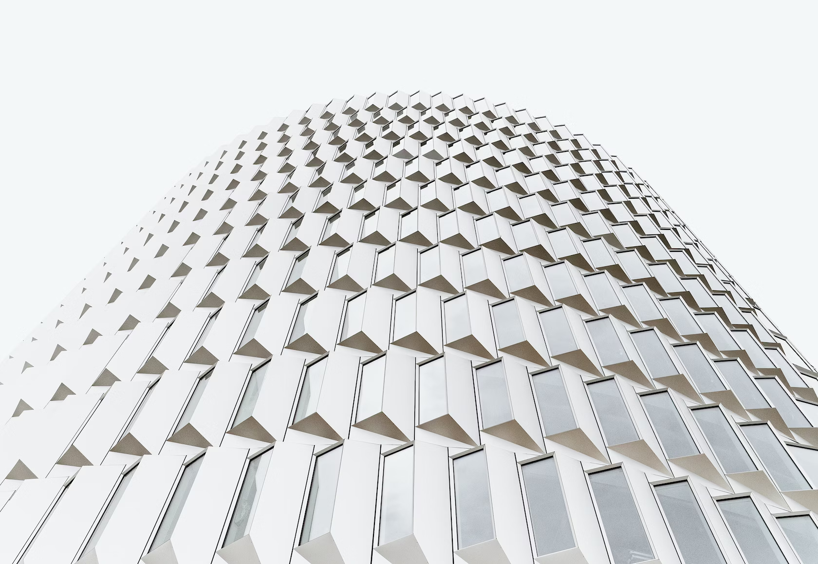
Francisco Tirado – Cobe Architects, Studio Winner, A+Vision Awards 2023, Best Of The Year, Architectural Photographer Of The Year 

There’s a Bart Simpson-esque joke in there somewhere, but let’s keep it professional…

Honestly, seeing more doesn’t always mean spending lots of money, booking lots of trips, and traveling around the world — as much fun as that can be. Seeing more can also mean taking notice of your immediate surroundings. We are almost all somewhere someone else wants to visit. So, be a tourist in your own town. Wander, explore and uncover the story of the architecture around you. Or, if you’re a fan of a plan, you could take it one step further and make a list of buildings you haven’t seen yet, or you’d like to see again and map out a route to visit them.

Explore where you are, and while you are at it, you can develop your photography skills by challenging yourself to take at least one photo a week of a building, a material or architectural detail that inspires you. By the end of the year, you’ll have fifty-two images that are a timeline of 2024.

You never know. You might even take a photograph that wins Architizer’s 2024 A+Awards.


Find Inspiration.
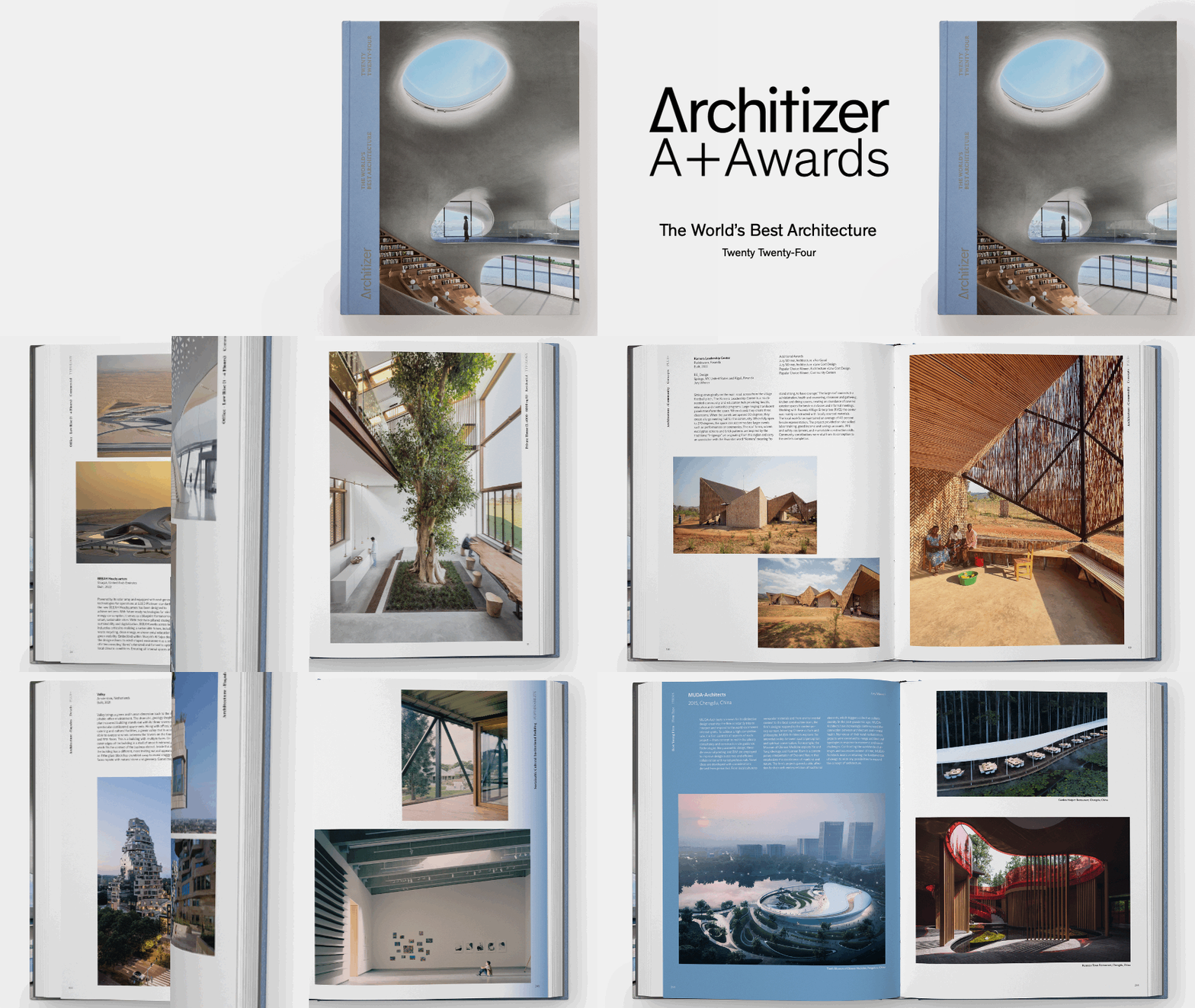
Finding new ways to be inspired is a year-round challenge. So, how about setting yourself a resolution that will give you the creative boost you need this year?

You could pick a country, one for each of the twelve months of the year, and commit to learning about its architectural heritage, its most recognized style, or its most well-known architect. You can find some great examples in Architizer: The World’s Best Architecture. By the end of 2024, you’ll have a knowledge of global architecture that could rival anyone in the office, and I bet you’ll be surprised at how much more diverse and exciting your projects become after just a few months.

Or if international architecture seems like too broad and overwhelming before you’ve even begun (this is always a pitfall with resolutions. They should be something you could actually achieve), why not work your way through the alphabet instead? A for Atrium, B for Balcony, C for Columns and so on? It’s a quick and easy approach to expanding your design horizons, and the topics can be as broad or as specific as you choose.


Go Green.
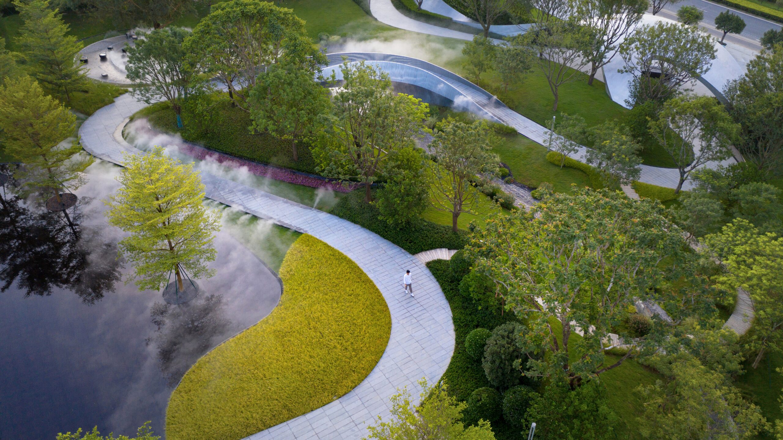
Eucalyptus Society Garden by SWA GROUP / Los Angeles, Guangzhou, China. Popular Choice Winner, 11th Annual A+Awards, Public Parks & Green Spaces 

I think it is safe to assume this one is on pretty much every architect’s list for 2024. Be more eco-conscious, be less wasteful and design smarter for the planet and its people. However, you frame it —this one is a biggie. Oh, but what to do? How about pledging to incorporate at least one additional sustainable design element in every project? This could range from using a recycled material to adding an innovative energy-saving product. But the catch is that it has to be one you added above and beyond your initial proposal; that way, you’re boosting your impact. Start with one and see how many you can add.

Or, if you’re the type of person who responds better to financial penalties, what about implementing a personal swear jar? Instead of being penalized for cursing, you need to cough up every time you specify using non-sustainable material. It’s a great way to keep yourself accountable for your choice, and at the end of the year, you can donate the cash to a worthy cause.


Prepare for the future.
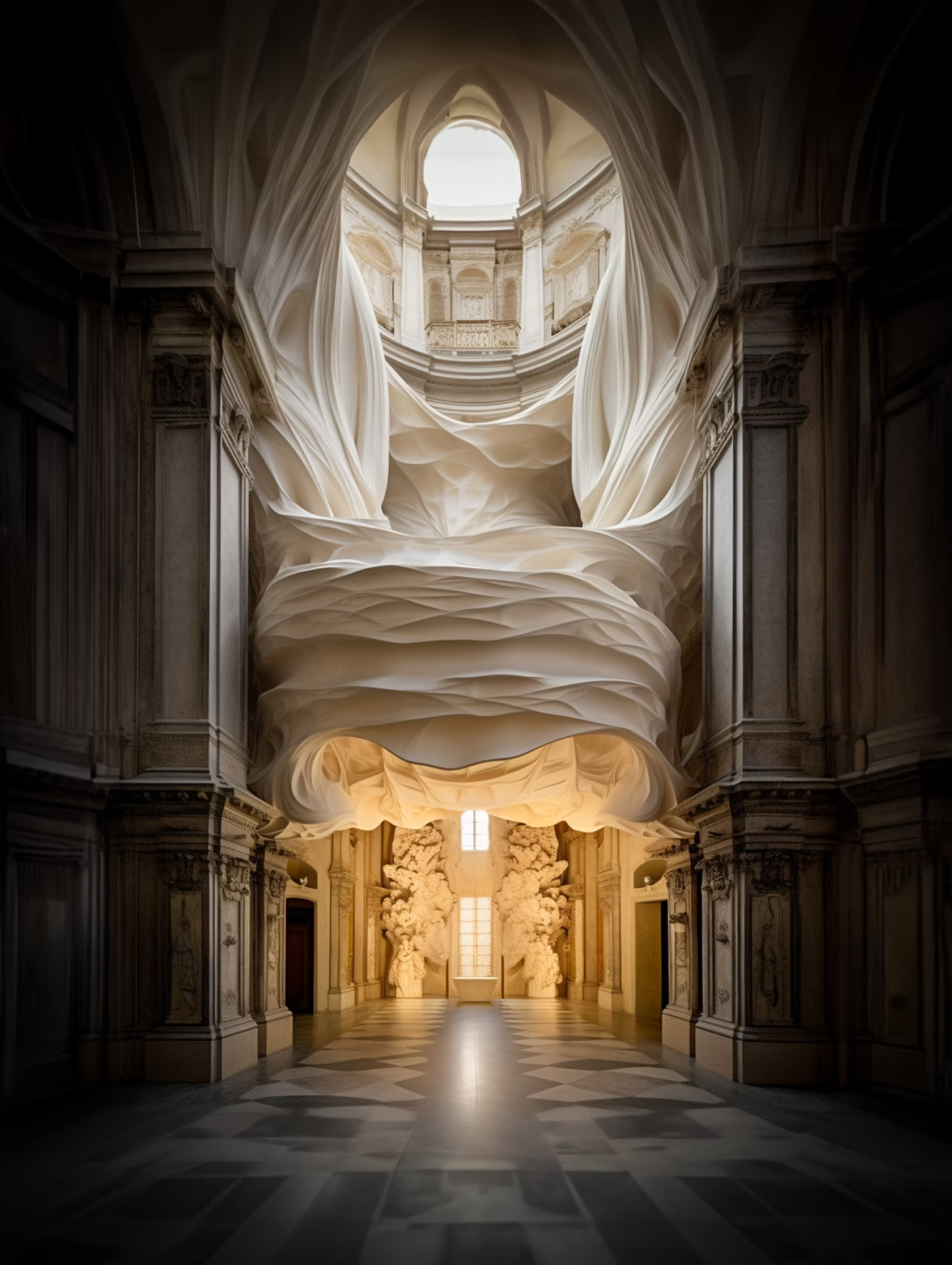
Silk & Stone by Mohammad Qasim Iqbal. Student Winner, A+Vision Awards 2023, Visualization, Ai Assisted Visualization.

The future is here, and there is no denying it. AI, VR, and all the other acronyms you can think of are here to stay. So, this year, your resolution could help you prepare and keep you at the forefront of the monumental changes we are witnessing.

Get going with virtual reality. Whether it’s using VR for client presentations or exploring virtual construction, stop messing with the 2D and get yourself involved in the virtual world. Not only will you have a blast messing about in your models, but your clients will also thank you for making understanding space planning so much easier.

Or get ahead of the game in AI. If you still need to, resolve to learn what it is and how it’s going to help you as an architect. You can make it your mission to listen to every episode of Evelyn Lee’s Practice of Architecture podcast, or you can sign up for something like wordsmith Nikita Morell’s ChatGPT for Architects Masterclass.

You could even stick your alerts on for LinkedIn posts from our very own Editor-in-Chief Paul Keskeys and read the reviews on Architizer Tech to get updates on the latest applications, innovations and tips that will keep you up to date on what’s hot and what not in the tech-o-sphere. (we think you should do this either way).


Rein it in.

As architects and designers were often told, our industry is complicated, exclusive and inaccessible. And in some cases, they would be right. So, this year, why not simplify things? Ditch the dialogue. Challenge yourself to stop using architectural jargon, be direct and to the point and say exactly what you mean. At the end of the day, you might find it improves your business when people actually understand what you are talking about.

Or if thats not your problem, what about committing to downscaling overly ambitious ideas? We often get carried away, going smidge overboard every now and again. In all fairness, it’s often part of the fun. I do not deny there is a time and place for glass columns and gold-plated beams, but how about, if you find you’re one of those architects who spends more time scaling back than scaling up, that this year you challenge yourself to rein it in and refocus your precious time on to yourself instead of arguing the necessity of triple height ceilings in the guest bathroom that no one asked for?


Banish the beige.
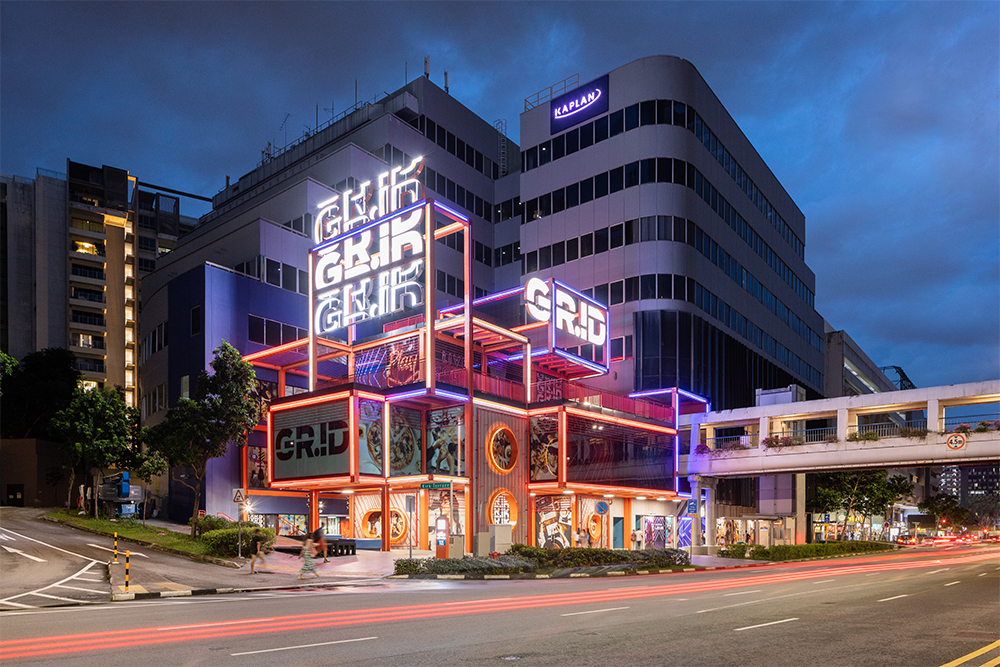
GRiD by Spark Architects, Singapore. Jury Award Winner, 11th Annual A+Awards, Retail. Photographs by Fabian Ong.

Or, if your thinking, “count me out of reining it in,” then it’s time to toss out the tepid and embrace the bold. Beige isn’t just a color; it’s a symbol of safe choices that lull us into a creative slumber. This year you could set yourself the task of shake off that drowsiness and give your work some much-needed pizzazz.

Think about it. When was the last time you stepped out of our comfort zone with color? I’m not talking about a touch of terracotta or a splash of sage. I’m talking full kaleidoscope. It’s not just about painting the town red (or green, or purple). Let’s get inventive with our spaces have a heart-to-heart with our materials. This year could be a great time to experiment and give your designs the innovative eye they deserve.

And who knows, those eye catching hues it might just be what makes them stand out to our jurors in future A+Awards competitions.


Celebrate the wins.

And finally, and in my opinion, most importantly, celebrate the wins! We said that the new year is all about reflecting and looking back at our achievements, recognizing what we did well or not so well. But why wait? Why not celebrate the wins as and when they happen? Commit yourself to taking time out, whether it’s a day, an hour or a week, to really appreciate the times that things went well. Don’t just move on to the next challenge and forget to take time to pat yourself and your team on the back and say, “Well done!”

The latest edition of “Architizer: The World’s Best Architecture” — a stunning, hardbound book celebrating the most inspiring contemporary architecture from around the globe — is now available. Order your copy today.  

Reference

Happy new year from Dezeen!
CategoriesInterior Design

Happy new year from Dezeen!

Firework displays on MSG Sphere Las Vegas

Happy new year from Dezeen! We’ll be back tomorrow, but in the meantime, you can read about the biggest design and architecture stories of 2023 and our full review of the year.

The review looks at the most interesting architecture, design and interior stories from 2022. It includes roundups of the the year’s rebrands, innovative materials, restaurant and bar interiors, controversies, US architecture, cabins and more.

Read the review of 2023 ›

The photo of the Las Vegas Sphere is by Sphere Entertainment.

Reference

New Serpentine Pavilion “definitely” more sustainable than last year
CategoriesSustainable News

New Serpentine Pavilion “definitely” more sustainable than last year

The 2022 Serpentine Pavilion is more sustainable than last year’s “carbon-negative” design thanks to its reusable foundations and timber floor, say its engineers AECOM.

This year’s edition of the annual London commission is a timber drum designed by American artist Theaster Gates. Last year’s design, by Counterspace, controversially claimed to be “carbon-negative” despite featuring concrete foundations that were not reusable.

The 2022 edition is “definitely” more sustainable, according to AECOM director Jon Leach.

Serpentine Pavilion 2022
This year’s Serpentine Pavilion was designed by Theaster Gates

Reducing the amount of concrete used and making the entire structure demountable, including the foundation, has reduced the building’s overall carbon footprint, he explained.

“Measured like-for-like, this year’s pavilion has a lower carbon footprint than the 2021 pavilion, largely because of the very light-weight timber superstructure and very small, reusable low-cement foundations that are ballasted with site-won fill,” Leach told Dezeen.

Last year’s pavilion, which featured timber and other biomaterials, removed 31 tonnes of carbon from the atmosphere, according to a report seen by Dezeen.

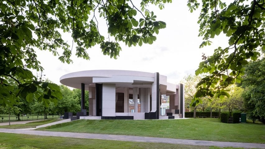
Serpentine Pavilion by Counterspace
South African studio Counterspace designed last year’s Serpentine Pavilion

However, the report did not include the impact of moving the pavilion to a new location, which would require breaking up the 95-cubic-metre concrete base and casting a new one.

This year’s pavilion is secured with a series of concrete pads that will be removed from the site and reused when the structure is re-erected.

“The foundations are completely reusable,” said Leach. “They will be transported with the rest of the pavilion.”

“They are small concrete pads that were precast using low cement concrete, which takes a bit longer to cure – so they were pre-cast off-site,” he continued. “They can just be lifted out.”

Above ground the pavilion, which is the largest ever built on the site, was designed to be as lightweight as possible. This allowed AECOM to reduce the scale of the foundations by 75 per cent.

“The aim has been to improve year on year,” explained Leach. “So the key thing with this year’s was that it’s large, but it’s lightweight.

First Serpentine Pavilion without concrete floor

“So we focused on a timber, lightweight superstructure, and then really minimising the foundations as much as we can,” he continued. “So there’s still some concrete in the foundations, but it’s, it’s a quarter of what it was last year.”

To reduce the carbon impact, the pavilion does not have a concrete floor for the first time in the commission’s history. Instead, a raised timber floor was installed.

“All the previous pavilions have had concrete floors, mainly for durability,” said Leach. “This year we discussed with the gallery and decided we really need to take a step away from that as a principle.”

Interior of 2022 serpentine Pavilion
A raised timber floor was used to reduce the need for concrete

“We’ve done a lot of tests on making sure the timber should last for the summer with 300,000 visitors,” he added.

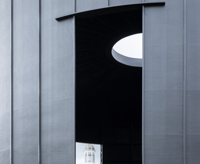
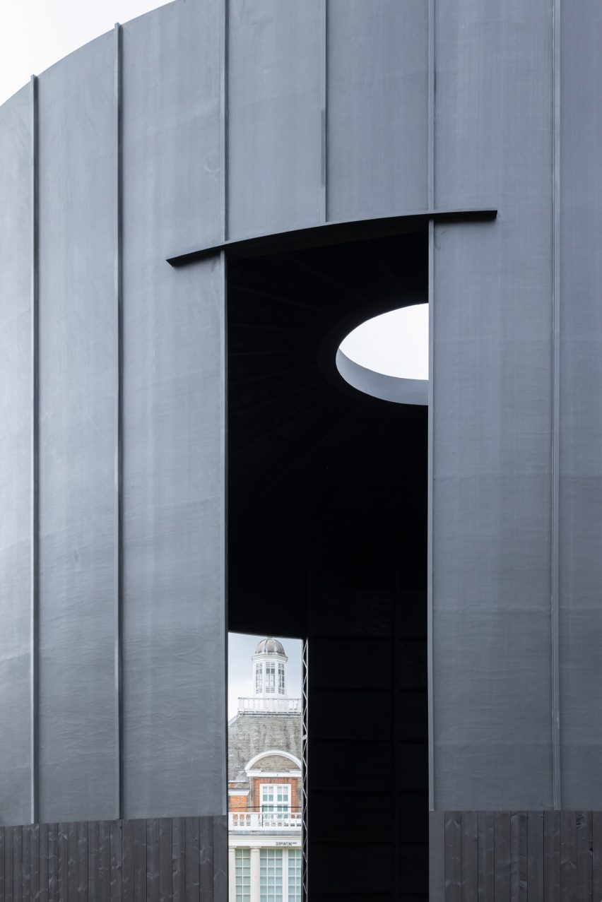
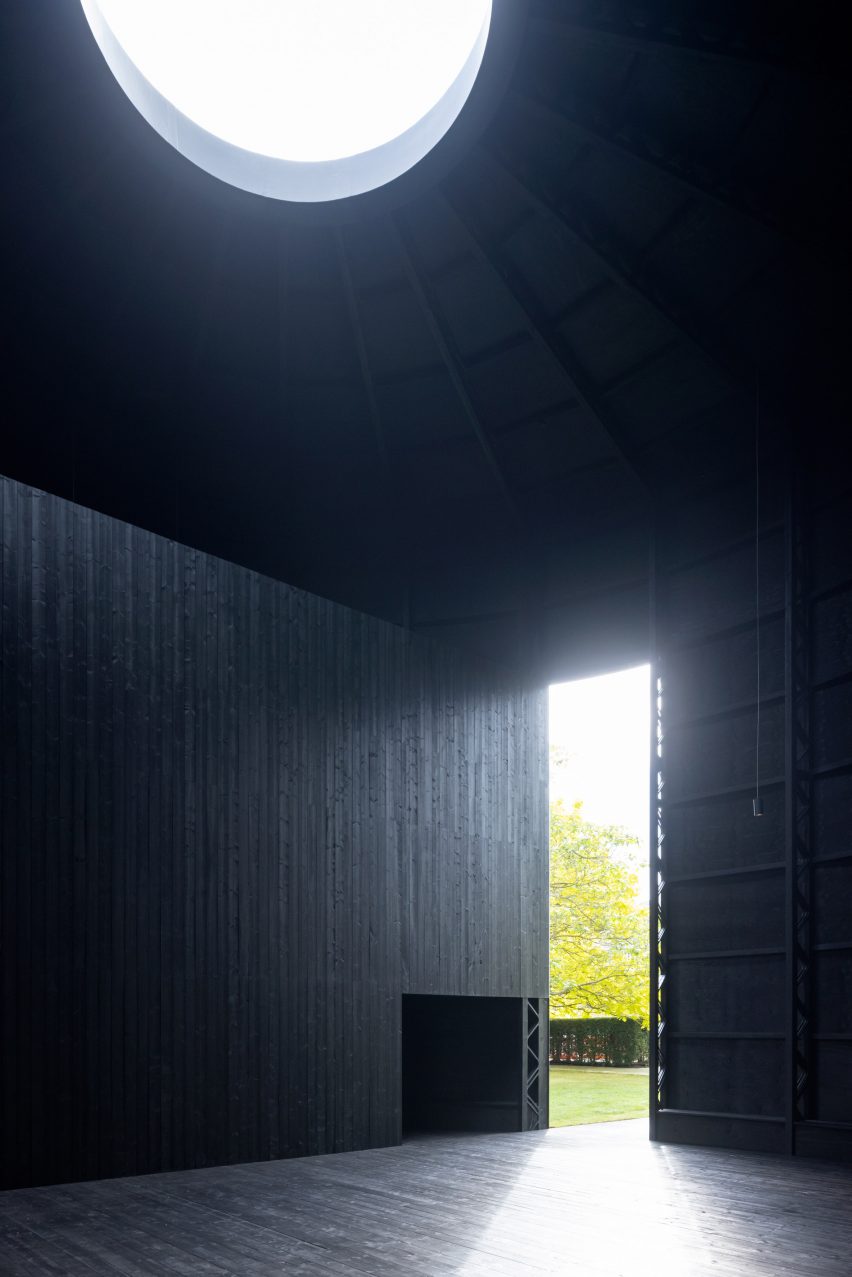
Designed by American artist Gates, the 2022 Serpentine Pavilion is named Black Chapel. It was designed to be a peaceful space “where one could rest from the pressures of the day and spend time in solitude”.

The cylindrical building was built largely from timber with MiTek posi-joists used as columns and nine-millimeter thick plywood used as the skin. The roof contains steel rings to support a central oculus.

Gates’ building is the 21st edition of the annual Serpentine Pavilion, commissioned by the Serpentine contemporary art gallery in London.

Previous architects have included last year’s Pritzker prize-winner Diébédo Francis Kéré, who designed a structure with a canopy that transformed into a waterfall during rain, BIG founder Bjarke Ingels, who worked with an “unzipped” wall of translucent blocks, and late British-Iranian architect Zaha Hadid whose marquee launched the commission in 2000.

The photography is by Iwan Baan.

Reference

This week we revealed Wild Wonder as 2023’s Colour of the Year
CategoriesInterior Design

This week we revealed Wild Wonder as 2023’s Colour of the Year

Colour of the Year interior

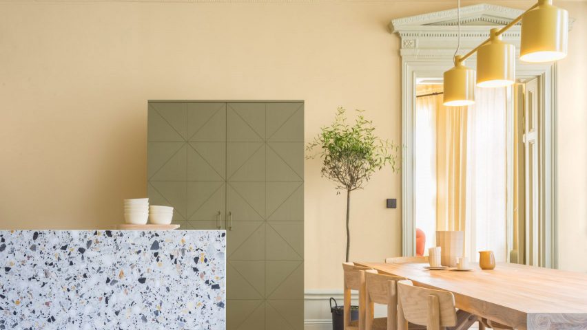
This week on Dezeen, the Colour of the Year 2023 –  a pale yellow that is described as “a soft gold with hints of green” – was announced.

To mark the announcement by paint company Dulux, we created a lookbook that showcases interiors that have used the pale yellow hue.

Revamp of Venturi Scott Brown's National Gallery
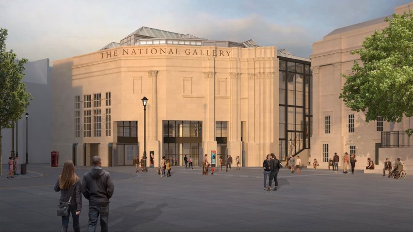
Selldorf Architects has proposed a redesign of the Sainsbury Wing

This week, architects, critics and academics raised concerns about the plans to remodel Robert Venturi and Denise Scott Brown’s postmodern Sainsbury Wing at the National Gallery in London. They described the plans, which have been drawn up by Selldorf Architects, as an “act of vandalism”.

In an opinion piece for Dezeen, Catherine Slessor wrote that “history now seems to be repeating itself at the Sainsbury Wing”.

Atomik Architecture staff who are balloting to strike
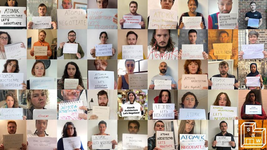
Workers at Atomik Architecture are balloting to strike

Also in London, staff at architecture studio Atomik Architecture announced a “historic strike ballot”.

Workers at the studio notified their employers that they were initiating a strike ballot to demand improvements to both their pay and working conditions.

Lightyear 0 solar-powered car silhouetted against a black backdrop
Lightyear developed “the world’s first production-ready solar car”

Continuing our Solar Revolution series we interviewed Emanuele Cornagliotti, who is the lead solar engineer at car company Lightyear, which developed “the world’s first production-ready solar car”.

Solar cars will be “normal within 20 years,” he told Dezeen.

King Charles III on architecture
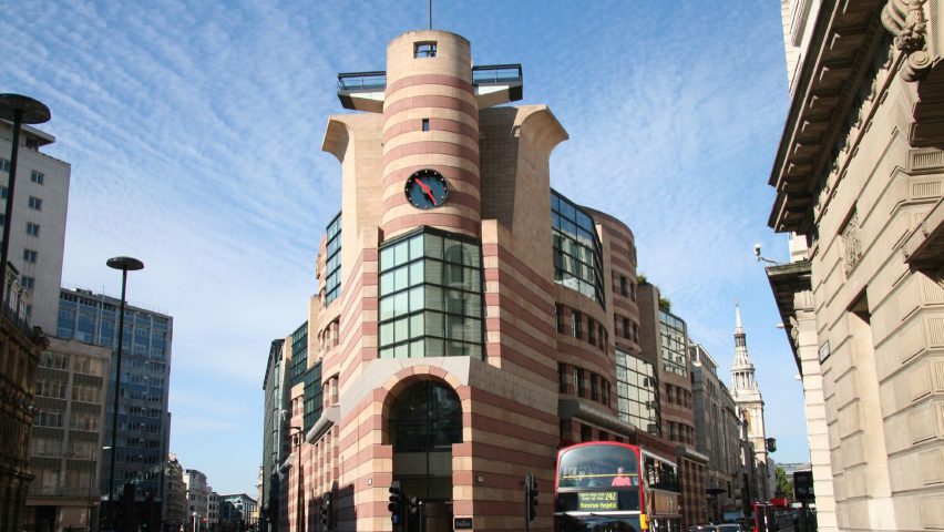
No 1 Poultry was the result of a King Charles intervention

Following King Charles III becoming Britain’s new monarch, we took a look back at his impact on architecture while he was the Prince of Wales.

In his previous role, Charles exerted significant influence on the built environment through campaigning, building traditional towns and torpedoing modernist projects.

Dezeen Awards 2022 public vote
Dezeen Awards 2022 public vote opened this week

This week we opened the Dezeen Awards 2022 public vote to allow readers to pick their favourite projects and studios. Readers can now vote for the best projects shortlisted in the architecture, interiors and design categories, as well as our media and sustainability categories.

Voting closes on 10 October with winning projects receiving a special Dezeen Awards 2022 public vote certificate.

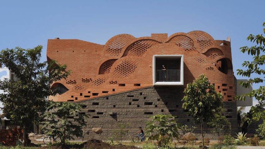
PMA madhushala wraps Indian home in perforated wall of brick and stone
Indian studio PMA Madhushala designed a brick and stone house

Popular projects this week include an Indian home wrapped in a perforated wall of brick and stone, a hotel resembling an upside-down village in the Alps and a rammed-earth retreat in São Paulo.

This week’s lookbooks showcased eateries that showcase the potential of terrazzo and kitchens with polished granite surfaces.

This week on Dezeen

This week on Dezeen is our regular roundup of the week’s top news stories. Subscribe to our newsletters to be sure you don’t miss anything.

Reference

Wild Wonder named Dulux Colour of the Year 2023
CategoriesInterior Design

Wild Wonder named Dulux Colour of the Year 2023

Paint brand Dulux has revealed Wild Wonder, a pale yellow paint colour that it described as “a soft gold with hints of green” as its Colour of the Year for 2023.

Wild Wonder was selected for its close association with nature. The brand said this echoes the global shift toward sustainability, reconnecting with the outdoors and wanting to be more grounded, particularly following the recent period of uncertainty.

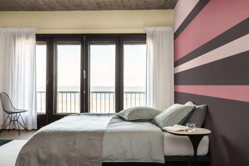
A bedroom interior with one golden wall
Wild Wonder is a golden green paint colour

“Our relationship with the natural world feels more precious and precarious than ever,” said Dulux UK.

“Wild Wonder is a soft gold with hints of green inspired by fresh seed pods and harvest grain,” the brand added.

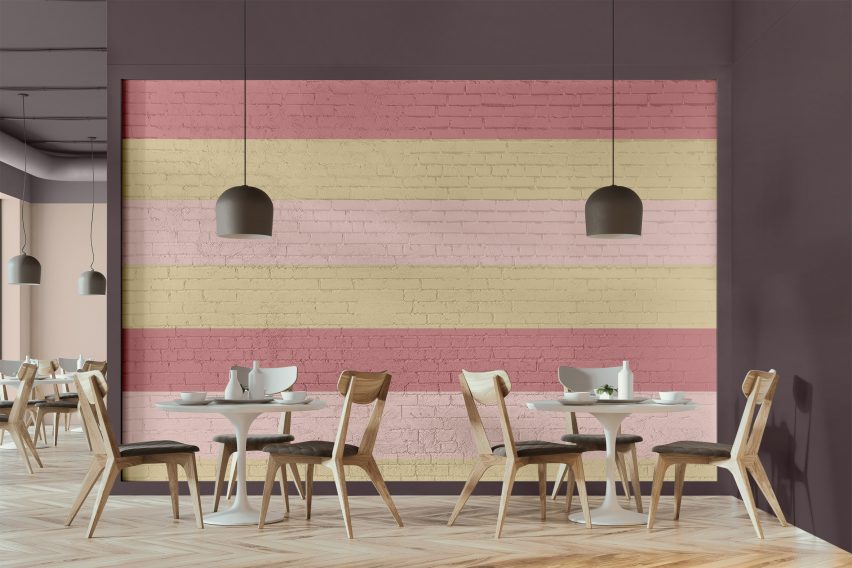
A pink and yellow wall in a cafe
The colour was selected for its association with nature

As well as its affiliation with nature and raw materials, Wild Wonder is also intended to capture the collective quest for better mental health, which has become increasingly important in light of global events such as the climate crisis and coronavirus lockdowns.

“As people search for support, connection, inspiration and balance in the world today, they’re diving into the wonders of the natural world to find it,” said the brand.

“Wild Wonder is a positive, natural tone that, by connecting us with the natural world, can help us feel better in our homes,” it continued.

“As well as understanding the value of nature more keenly, with climate change becoming a reality for all of us, we also feel the urgency of reconnecting with nature and the necessity of working with rather than against it.”

According to the brand, the colour can be used to add colour to areas in the house, such as living rooms, that require warmth and light. The brand also said that the hue is suitable for commercial spaces across all sectors including schools and hospitals.

“Wild Wonder and four complementary, versatile colour palettes can be used to create stunning spaces across all sectors,” explained Dulux.

Wild Wonder Colour of The Year by Dulux
The paint colour is suitable for all commercial sectors as well as residential interiors

Dulux’s parent company AkzoNobel decided on the shade, which is the 20th colour to be chosen as a Dulux Colour of the Year, after a three-day workshop with a panel of industry experts from across the globe and months of researching with the paint company.

Wild Wonder is a slightly more upbeat hue than Brave Ground, an earthy beige that Dulux selected as its colour of the year for 2021 against the backdrop of the coronavirus pandemic.

The colour is a marked change from last year’s sky blue colour Bright Skies, which the brand said captured collective desires for a fresh start.

The images are courtesy of Dulux.

Reference

Ten students from the School of Visual Arts present their final year projects
CategoriesInterior Design

Ten students from the School of Visual Arts present their final year projects

An LGBT+ community centre that caters to Seattle’s queer population and a peace centre in Homs, Syria, are included in Dezeen’s latest school show by students at the School of Visual Arts.


Also included is a fermentation centre that explores the world of microflora and its relationship to our wellbeing and a design for a new bookstore in China that marries biophilic principles with traditional Chinese architecture.


School: School of Visual Arts, BFA Interior Design: Built Environments
Courses: Senior thesis
Tutors:
Anthony Lee and Gita Nandan

School statement:

“The interior design senior thesis year at the School of Visual Arts Interior Design: Built Environments department is the culmination of a year-long self-directed exploration. Each student has driven and developed an adaptive-reuse project from site selection through concept development, interior design, programming and furnishings.

“Every project is unique and tackles real-world issues such as a residence for the Harbor School on Governors Island and a centre for philosophers in Homs Syria.”


School of Visual Arts school show

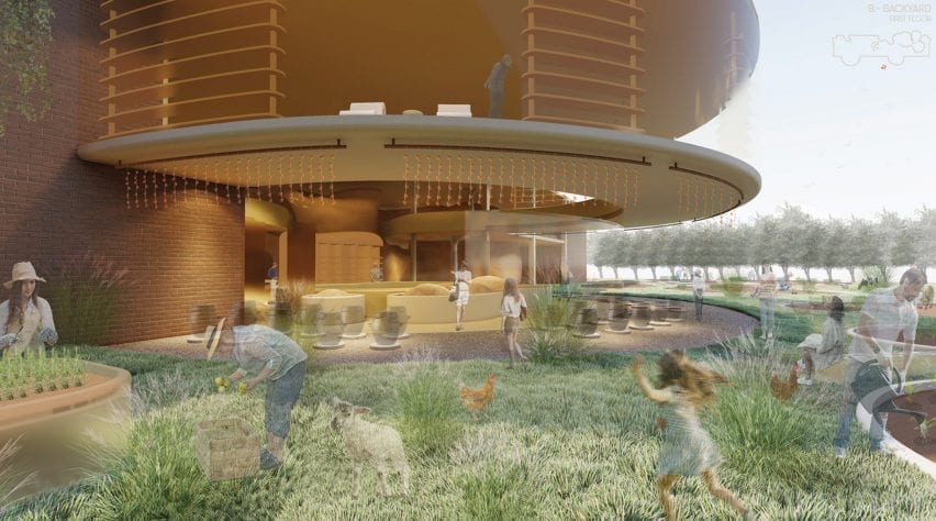
Oryzae Village by Chloe Hyun Jung Park

“Fermentation is an under-appreciated metabolic process that humans have embraced for thousands of years. It is responsible for a wide range of items we consume including beer, yoghurt, kimchi and penicillin. In this project, Oryzae Village is a fermentation centre that explores the world of microflora and its relationship to our health and wellbeing.

“It consists of farms, shops, residences and various engaging workshop areas. Fermentation experts and artisans lead the centre to create an environment for teaching, learning, sharing while creating products items using fermentation.

“Oryzae Village aims to revitalise the local communities by encouraging foraging, growing, investigating, and learning about microbial processes – helping people achieve healthier lives and wellbeing.”

Student: Chloe Hyun Jung Park
Course:
Senior thesis
Email:
chloehyun021@gmail.com


School for Visual Arts school show

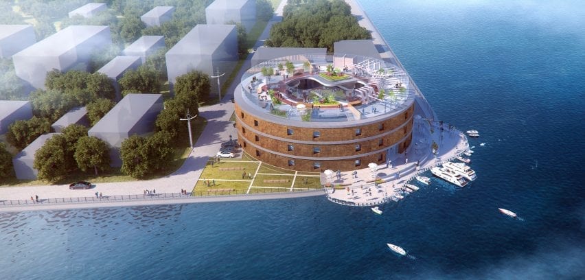
Harbor Residence by Iris Junhong Lin

“Being a high school student in New York’s award-winning Harbor School often means having to endure extremely long commutes from various corners of the five boroughs. Located on Governors Island, the school is accessible only by ferry. Harbor Residence is a student dormitory for these dedicated pre-college students committed to maritime studies, research and careers.

“In this project, Harbor Residence aims to be much more than just a place to live – it will be a continuation of the school’s maritime culture. Students will to able to live, socialise, learn, work at the residence – becoming a centre for the Harbor School Community.”

Student: Iris Junhong Lin
Course:
Senior thesis
Email:
jlin28@sva.edu


School for Visual Arts school show

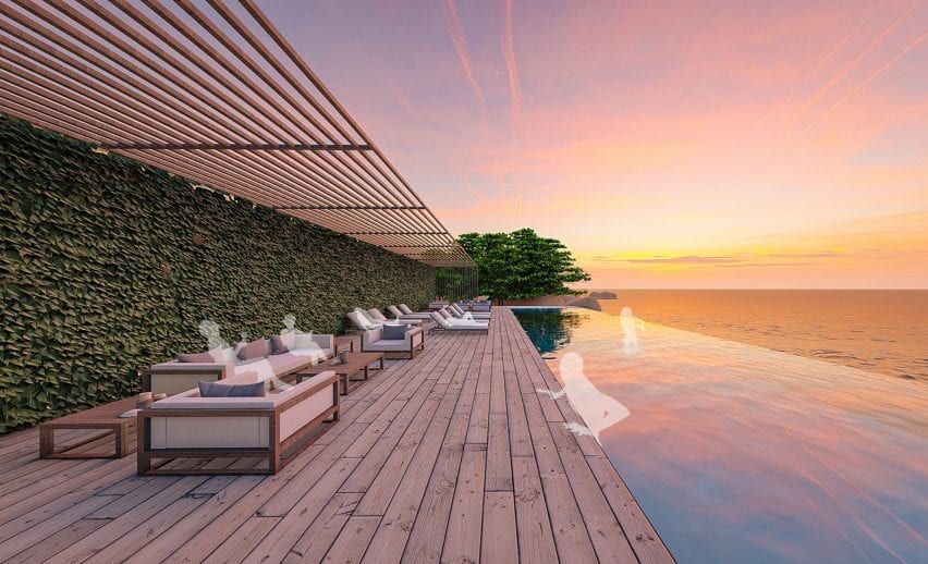
Cove by Stella Hanbyul Suk

“The pandemic has forced us to rethink travel. Urban dwellers with limited access to natural environments have been unable to travel long distances to connect with nature. Local travel may be the new normal in our post-pandemic tourism landscape.

“Cove is a wellness and activity centre that provides a tranquil and restful place in a natural setting within a relatively short distance from the major urban centres of South Korea. It is designed for people to unplug and reset their daily lives, improving both mental and physical wellness through high sensory involvement in a setting that connects back to nature.”

Student: Stella Hanbyul Suk
Course:
Senior thesis
Email:
st3lla.id@gmail.com


School of Visual Arts school show

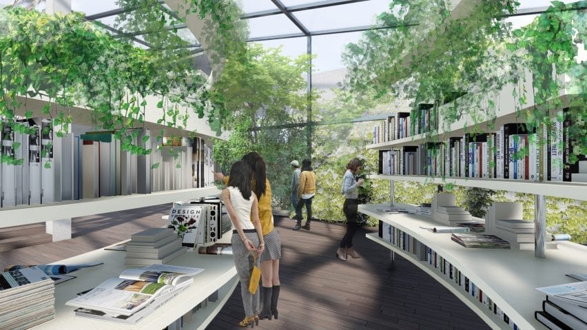
Alive Books by Difan Yang

“Alive Books is a new bookstore design in China. More than just a place to buy books, it is a gathering place where people can learn, communicate and exchange ideas.

“Marrying biophilic principles with traditional Chinese architecture, Alive Books aims to become the future of book retailers that will co-exist and survive the online bookselling landscape.”

Student: Difan Yang
Course:
Senior thesis
Email:
yang_difan@163.com


School for Visual Arts school show

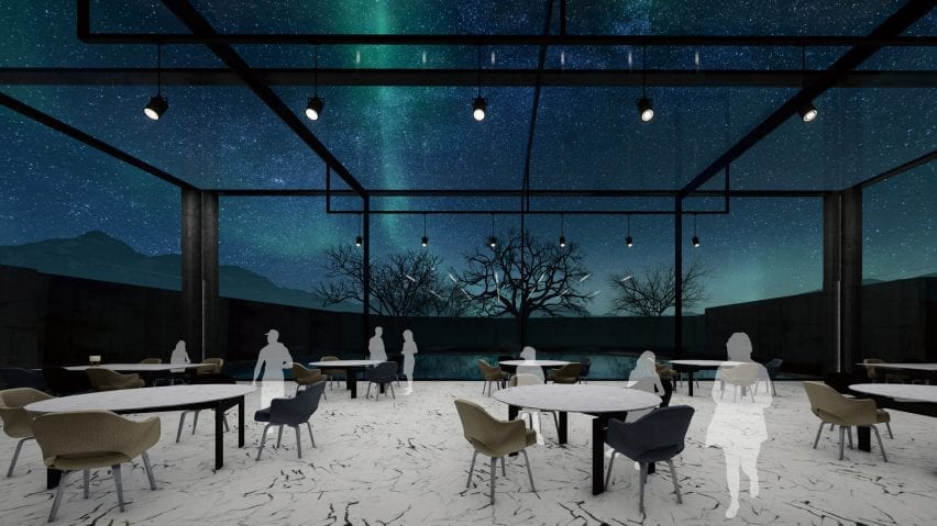
The Aurora by Ramey Yixuan Chen

“The Aurora is a hotel designed to maximize experiences of the Aurora Borealis, also known as the Northern Lights. Auroras result from disturbances in the magnetosphere caused by solar winds – resulting in otherworldly displays of atmospheric lights of varying colour and complexities.

“Located in Oblast, Russia, the Aurora Hotel is situated in the Arctic Circle with a relatively mild climate (due to the warm ocean currents crossing this seaside town).

“Because of its extreme northern location, visitors will be able to experience the ‘Polar Nights’ – when the night sky extends for periods longer than 24 hours – giving them unparalleled access to seeing the Aurora Borealis. The design of the hotel will focus on maximising the beauty of this atmospheric phenomenon while connecting visitors to nature.”

Student: Ramey Yixuan Chen
Course:
Senior thesis
Email:
ychencyx@gmail.com


School for Visual Arts school show

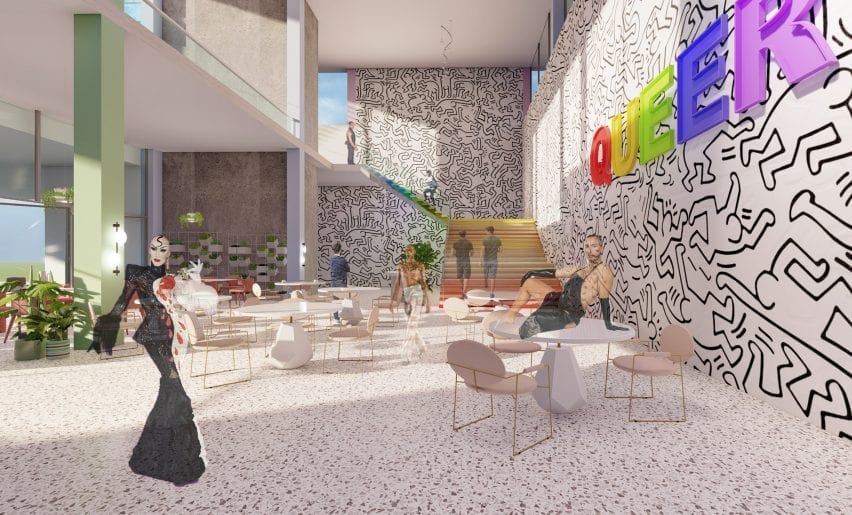
Queer Community Centre by Yearin ‘Rin’ Park

“Queer is the new LGBTQ+ centre in greater Seattle. Located adjacent to the University of Washington, Queer will cater to the vulnerable LGBTQ+ population and reflect core values of diversity, inclusivity and freedom of identity.

“Constantly under pressure and attack, the LGBTQ+ community needs a place to gather, grow, organise, support, heal, defend and celebrate queer experiences and identities. Now, more than ever, with trans people being ostracised, and the legality of gay marriage being questioned, Queer will be a welcoming and open centre for the entire Seattle community.”

Student: Yearin ‘Rin’ Park
Course:
Senior thesis
Email:
rinparkinterior@gmail.com


School of Visual Arts school show

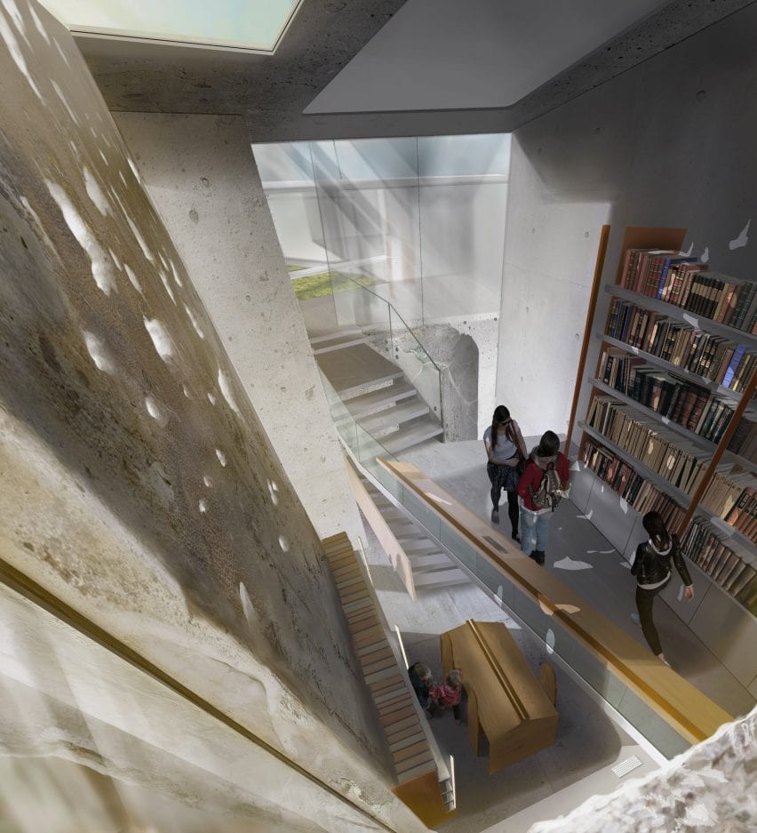
Bayt Al Kul Philosophy Centre by Fuad Khazam

“Bayt al-Kul (house of the all) is a philosophy and peace centre in Homs, Syria that aims to play a major role in healing a divided society by challenging beliefs through discussions and conceptual analysis. After a ten-year war that divided the Syrian people, Bayt al-Kul will give the people of Homs a chance to listen and share one another’s views through philosophical debate.

“For centuries, Homs was a cradle for philosophical education and the birthplace of many historical philosophers who contributed to the world today. By re-discovering the ‘world of ideas’ Bayt al-Kul aims to help rebuild the unity and cultural commonality among the Syrian people.”

Student: Fuad Khazam
Course:
Senior thesis
Email:
fkhazam@sva.edu


School of Visual Arts school show

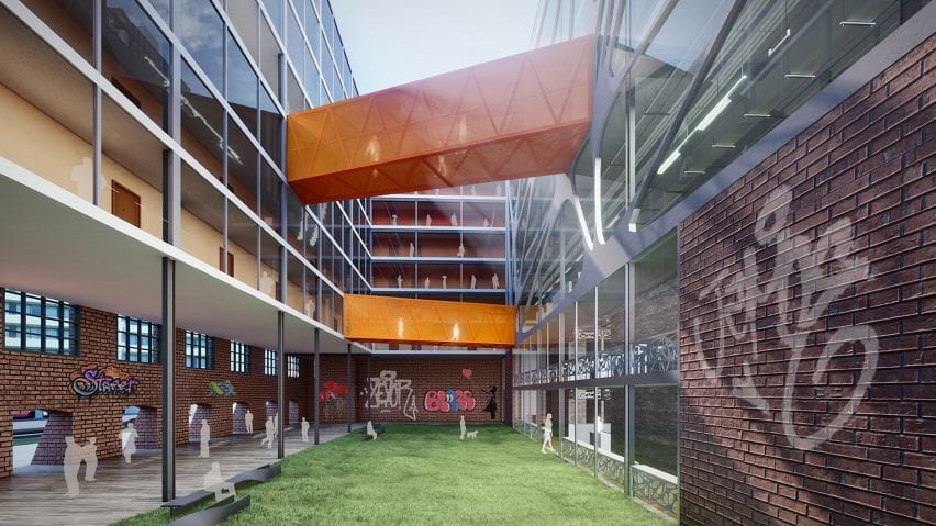
Al-station by Eason Yixuan Du

“Al-station is a live and work community dedicated to art school students marrying art studios with living space. Students from the New York City (NYC) area art institutions will be able to use Al-station as a place to live, study, work, create, show, play and gather.

“The space will serve as a hub for creative university students – nurturing the next artists and designers who are so important to the continued growth and vitality of NYC.”

Student: Eason Yixuan Du
Course:
Senior thesis
Email:
easondu09@gmail.com


Social Commune by Yangkai Lin school show

Social Commune by Yangkai Lin

“Over the past 30 years, the China Government has instituted a programme of poverty alleviation that relocated millions of scattered families living in rural areas, moving them closer to cities to provide social services such as healthcare and education. This caused thousands of villages across China to become empty, creating a landscape of forgotten places. Many of these abandoned villages – dating back thousands of years – should be preserved, reimagined and reused.

“Social Commune is an experimental design project that focuses on adaptive reuse of these forgotten places: transforming originally residential buildings into a series of public buildings that celebrate the unique characteristics of the local village and community.

“Through a mixture of preservation and modern design, Social Commune will breathe new life into these underutilised structures and will become a model for rehabilitating rural areas throughout China.”

Student: Yangkai Lin
Course:
Senior thesis
Email:
ykstv21@gmail.com


School of Visual Arts school show

Noah by Ekko Tianjuan Zheng

“Covid-19 has changed the world. Wuhan China – with a population of over 10 million – is thought to be the epicentre of the virus. With its own virus spread quickly under control, Wuhan is in a position to become a centre for viral studies – to help prevent such an epidemic in the future.

“Noah is an institute of virology in Wuhan. Located in an abandoned factory, an extensive renovation will transform it into a high-tech, unique, state-of-the-art research facility. Incorporating biophilic elements and principles, Noah will be an environment where science and nature come together, creating a laboratory and science centre for the 21st century.”

Student: Ekko Tianjuan Zheng
Course: Senior thesis
Email:
zhengtianyuan99@gmail.com


Partnership content

This school show is a partnership between Dezeen and the School of Visual Arts. Find out more about Dezeen partnership content here.

Reference