New York building facade
CategoriesInterior Design

Lissoni Architecture creates New York showroom with “melting pot attitude”

New York building facade

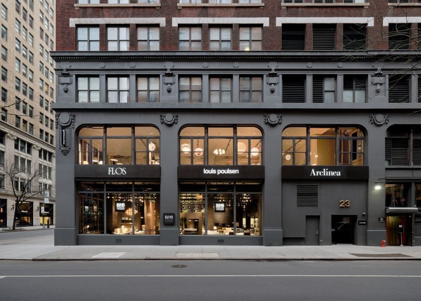
Local studio Lissoni Architecture has expanded the Design Holding flagship in New York City, creating an entirely new floor outfitted with light displays and curving metallic installations.

Lissoni Architecture, the US branch of Italian studio Lissoni & Partners, created an entirely new second floor and redesigned a portion of the first floor for the Design Holding showroom, which displays furniture and lighting brands including B&B Italia, Flos, Louis Poulsen, Maxalto, Arclinea and Azucena.

New York building facadeNew York building facade
Lissoni Architecture has created an expansion for the Design Holding showroom in New York

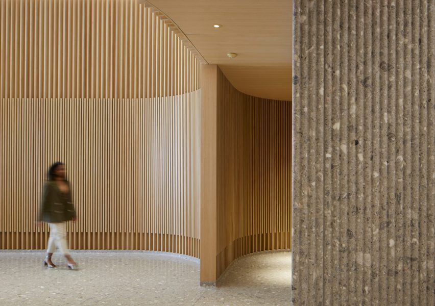
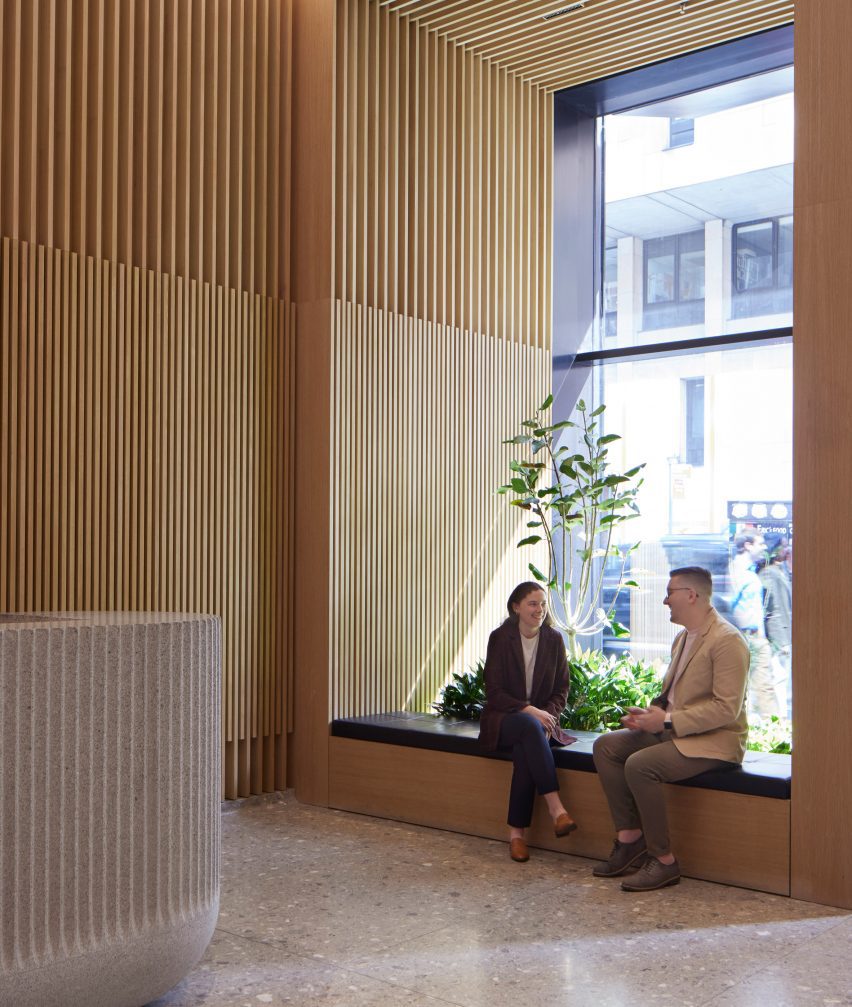
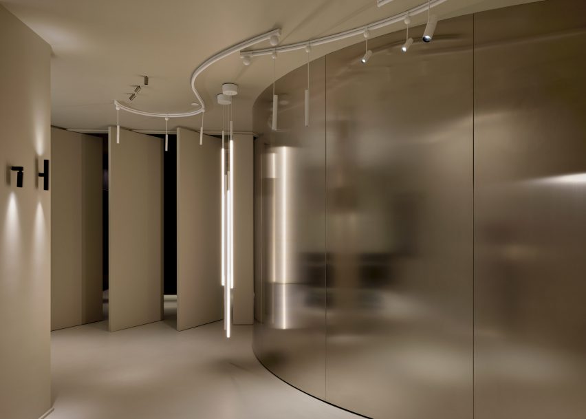
Lighting and design elements from the brands were distributed across the second-floor space, spread out amongst vertical stone-clad panels, transparent, metal showcases, and curving chrome benches and walls.

Each area of the floor was dedicated to a specific brand and the interior architecture was tailored to each brand’s identity, according to the studio.

Red chair in showroomRed chair in showroom
The project encompasses a new second floor and an expansion and redesign of the first

“We wanted to share the melting pot attitude of New York City where everyone and everything can blend together holistically so we went to the essence of the iconic brands,” said Lissoni Architecture founder Piero Lissoni.

“[We highlighted] their DNA and proposed a common ground that could host and enhance the design codes of each identity.”

A wall of lights and windowsA wall of lights and windows
The studio created dedicated areas for brands including Flos and B&B Italia

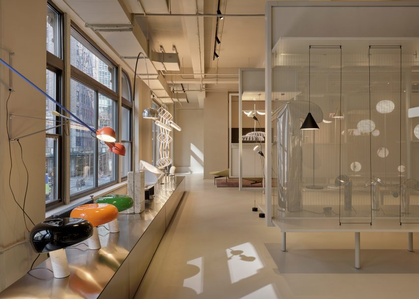
For lighting brand Flos, the studio created a series of display cases backed by a transparent mesh. A magnetized, geometric Bilboquet light by designer Philippe Malouin is on display, as well as the Almendra chandelier affixed with almond-shaped flakes by Patricia Urquiola.

A testing room for clients was also created for the brand, which consists of a curved, metal wall that meets a series of angled panels that act as an entrance for the room.

Tables in a showroomTables in a showroom
The various displays were informed by the “melting pot” attitude of New York City

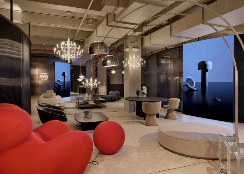
Another corner of the floor was dedicated to the display of the Skynest chandelier by Marcel Wanders, which resembles an inverted basket interlaced with cords of light.

Displays for Flos and Louis Poulsen consist of inserted panels and curving planting beds that are populated with a number of lighting fixtures from both brands.

A room with a curving metal wallA room with a curving metal wall
Metallic panels, warm wood, and dark cladding were used throughout the second-floor space

Dark, metal cladding used in the Flos displays contrasts the off-white and beiges used throughout the Louis Poulsen space, but both flank a B&B Italia lounge that sits at the centre of the floor, which features a bright-red chair from the Up series by Gaetano Pesce.

A B&B Italia wardrobe was also created for the showroom, which sits next to an Arclinea kitchen display.

A black ash finish was used to clad a large cabinet unit, which sits behind a Thea island topped with a quartz waterfall countertop.

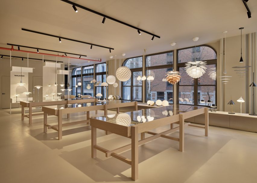
Lighting by Louis Poulsen, including the Patera Oval pendant by designer Øivind Slaatt, was tucked into the furthest corner of the space, with pieces distributed amongst wooden tables and a low-lying display unit.

A show room with white furnitureA show room with white furniture
A separate entrance leads to a Maxalto space on the first floor

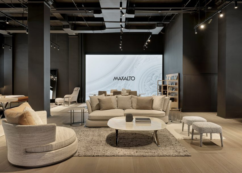
On the first floor, a new space dedicated to Maxalto is accessible through a separate entrance, with pieces such as the brand’s Arbiter sofa system positioned against walls clad in black.

Design Holding, a global retailer founded in 2018, recently added furniture brands Menu, By Lassen and Brdr Petersen to its portfolio after an agreement with Denmark-based company Designers Company.

Piero Lissoni announced the founding of the US branch of his studio last year, saying that the US has become more “open-minded” in terms of architecture.

The photography is courtesy Design Holding.

Reference

Apartment with green bedroom, blue kitchen and pink storage
CategoriesInterior Design

Ideas of Order selects bright colours for New York apartment renovation

Apartment with green bedroom, blue kitchen and pink storage

Bright hues define the different interventions that New York architecture studio Ideas of Order has made in this apartment at the northern tip of Manhattan.

The 1,000-square-foot primary residence in Hudson Heights was partially renovated for a couple, who had been living in the space for several years before deciding to invest in making it better suited to their needs, rather than buying another apartment.

Apartment with green bedroom, blue kitchen and pink storageApartment with green bedroom, blue kitchen and pink storage
One side of this Manhattan apartment was overhauled by Ideas of Order to make it function better for its owners

“Their sons had been sharing a room, but were beginning to need their own spaces,” Ideas of Order told Dezeen.

“They also wanted a space that could be designed for flexibility for when their children left for college.”

Bedroom with lime green built-ins housing a bed, a desk and storageBedroom with lime green built-ins housing a bed, a desk and storage
In the newly created bedroom, a lime green built-in houses a bed, a desk and storage

The kitchen also needed updating, to make it more suitable for entertaining, and more efficient storage space was required in the entryway.

So the architects reworked one side of the open living area, adding a bedroom on one side of the kitchen and refreshing the other areas.

Blue and purple kitchen cabinets behind a concrete counterBlue and purple kitchen cabinets behind a concrete counter
A new wall divides the bedroom from the kitchen

The husband is French, and the couple spent several years living together in France.

During this period, they both became enamoured by the midcentury architecture and design in the country and wanted to apply this style to their own home.

Raspberry and periwinkle cabinets surrounding a cooking area, which also features aluminium panelsRaspberry and periwinkle cabinets surrounding a cooking area, which also features aluminium panels
Raspberry and periwinkle cabinets surround the cooking area, which also features aluminium panels

“Inspired by their stories and the history of how colour was used by French midcentury designers like Charlotte Perriand, we suggested a series of polychrome millwork pieces inspired by Perriand’s design language, but updated for a contemporary home,” said Ideas of Order.

The different areas of the home were therefore given their own identities by applying bright hues.

Kitchen with cabinets on two sides and a porthole in the end wallKitchen with cabinets on two sides and a porthole in the end wall
A porthole looks through from the bedroom into the kitchen, which has rubber flooring

Lime green is used in the bedroom across a full wall of built-ins that incorporate a single bed, a workstation and plenty of storage.

Sliding doors with fritted glass panels pull across to enclose the slightly raised room, while a porthole window with double shutters looks through the new wall that separates the kitchen.

Pink and grey built-in storage in an entrywayPink and grey built-in storage in an entryway
Storage in the entryway was made more efficient by new pink and grey built-ins

This adjacent space is denoted by raspberry and periwinkle millwork, which surrounds a small preparation area with an aluminium backsplash and matching panels above.

The same metal also fronts the bar counter between an arched opening to the living area, which is topped with concrete.

Kitchen viewed through an arched openingKitchen viewed through an arched opening
Archways between spaces throughout the apartment have curved corners

Rubber flooring in the kitchen offers a practical alternative to the wood used through the rest of the apartment.

Finally, in the entryway – which is again raised slightly higher than the living area – an L-shaped cabinet system was constructed in a corner beside the door.

Pale pink is applied to the frames, while the doors and drawer fronts are finished in light grey and walnut is used for the trim. Choosing the right hues was a challenge that took many iterations to find the right balance, according to the architects.

“It was important that each pair of colours in the millwork work together, but that the colours also harmonise when viewed as a whole,” they said. “We wanted the colours to be bright, but not overpowering. And we wanted the colour pairings to feel timeless and not too trendy.”

Lime green bedroom to the left and blue kitchen to the rightLime green bedroom to the left and blue kitchen to the right
The architects went through many iterations to find the right balance of colours

Another challenge was the budget, which was modest by New York City standards and required some conscientious spending – particularly on small details that would make a big impact.

“We love the custom pulls for the millwork, the shutters for the circular window, and the rounded end to the partition between bedroom and kitchen, which reflects the rounded openings throughout the apartment,” the architects said.

Wide view of an apartment with wooden floors, white walls and colourful accentsWide view of an apartment with wooden floors, white walls and colourful accents
The couple had been living in the space for several years before deciding to invest in making it better suited to their needs

Ideas of Order was founded by Jacob Esocoff and Henry Ng, who are both Fosters + Partners and WORKac alumni.

Their renovation is one of the most colourful interiors we’ve featured in New York City of late, compared to a neutral show apartment inside the One Wall Street skyscraper and a loft in Dumbo with a subdued palette.

The photography is by Sean Davidson.

Reference

Store interior with white walls, wooden floors and a central yellow column
CategoriesInterior Design

Yellow lighting illuminates Le Père store in New York by BoND

Store interior with white walls, wooden floors and a central yellow column

New York architecture studio BoND has used tubular lighting to create a bright yellow glow inside this men’s apparel store on Manhattan’s Lower East Side.

The first flagship for cult fashion label Le Père occupies a 1,000-square-foot (93-square-metre) corner unit on Orchard Street.

Store interior with white walls, wooden floors and a central yellow columnStore interior with white walls, wooden floors and a central yellow column
The flagship store for Le Père is largely painted white to allow the bright clothing to stand out

Utilising the store’s large exposure to the street, BoND opted to create an interior that would be just as impactful from the exterior as it is once inside.

“BoND designed the store to feel like a canvas, highlighting the design elements of the clothes while ensuring the space is a place that creators feel encouraged to spend time in,” the team said.

A central column encased in a translucent yellow boxA central column encased in a translucent yellow box
A central column is encased in a translucent yellow box

The firm’s approach was to leave the majority of the space white, allowing the boldly patterned clothing to stand out, then highlighting the fitting rooms using bright yellow lighting and surfaces.

A structural column in the centre of the store encased in a translucent box is also fitted with lights to give off a sunny glow.

Yellow fitting room with a rail of clothing to the rightYellow fitting room with a rail of clothing to the right
Yellow lighting installed in the fitting rooms emits an inviting glow

This yellow aura is immediately apparent from the street and is meant to entice passersby to step inside.

Neon lighting has seen a resurgence in retail and other commercial interiors of the past year, appearing everywhere from a Brooklyn cafe to a Calgary chicken shop.

Pair of yellow fitting rooms with tube lights either side of the mirrorsPair of yellow fitting rooms with tube lights either side of the mirrors
The tube lights were installed on either side of mirrors in the fitting rooms, which are also yellow

At Le Père, other elements like the tops of vintage Artek furniture are coloured red and black, to borrow from the street signs across the neighbourhood.

Floor-to-ceiling curtains along the back wall create a soft and neutral backdrop for the apparel, which is displayed on industrial metal racks.

Close-up on a curved bench with a row of cylindrical seat pillowsClose-up on a curved bench with a row of cylindrical seat pillows
Custom furniture pieces were designed by BoND and fabricated by Lesser Miracle

Wide-plank wood floors are laid across the main shop floor, which doubles as a space for gatherings, conversations, exhibitions and events.

Custom furniture pieces including a curved bench were designed by BoND and fabricated by Brooklyn design and art studio Lesser Miracle.

“The design scheme blurs the lines between a store, a home and an art studio – a space that is both aspirational and livable, combining contemporary and historic elements as a playful strategy,” said the studio.

On the exterior, a generous portion of the facade is given over to a giant billboard that Le Père will use to present its seasonal visual campaigns and artwork by the brand’s collaborators.

Billboard across a storefrontBillboard across a storefront
A large portion of the facade is given over to a billboard to display the brand’s campaigns

The debut placement for Fall/Winter 2023 was titled And Sometimes Boys and influenced by the work of Korean visual artist Nam June Paik.

BoND was founded by Noam Dvir and Daniel Rauchwerger, who previously designed the global headquarters and showroom for the Brazilian brand PatBo in New York.

Le Père store exterior on Orchard StreetLe Père store exterior on Orchard Street
The glow from the yellow lighting is designed to entice in shoppers on the Lower East Side. Photo by BoND

The duo earlier overhauled an apartment in Chelsea for themselves, turning the dark, divided space into a light-filled home.

The photography is by Stefan Kohli, unless stated otherwise.


Reference

Cafe with concrete walls, ceiling and floor
CategoriesInterior Design

Commoncraft draws on “beauty in imperfection” for New York cafe

Cafe with concrete walls, ceiling and floor

Distressed concrete, rowlock bricks and worn plasterwork create an intentionally unfinished appearance at this cafe in New York City’s East Village neighbourhood, designed by Brooklyn studio Commoncraft.

For its expansion into Manhattan, New Jersey-based Kuppi Coffee Company secured a 350-square-foot space on bustling St Marks Place – its second location.

Cafe with concrete walls, ceiling and floorCafe with concrete walls, ceiling and floor
Textured concrete plaster envelops the interior of Kuppi Cafe in the East Village

The compact interior has just enough space for a customer area and the cafe counter, plus a prep area and a WC for staff at the back.

Commoncraft approached the front-of-house space with an ethos akin to wabi-sabi, the Japanese art of “flawed beauty”.

Cafe counter faced with rowlock-course bricksCafe counter faced with rowlock-course bricks
Commoncraft chose materials for the space that appear purposefully rough and unfinished

“Employing a range of rough and raw materials, Commoncraft’s design of Kuppi Cafe seeks out the beauty in imperfection,” said the studio, which was founded by Zach Cohen and Tony-Saba Shiber.

Textured concrete plaster curves up from two perpendicular walls and over the ceiling, enveloping the room together with the concrete floor.

Concrete interior with small brick bench against a wallConcrete interior with small brick bench against a wall
The compact space features a small bench for customers awaiting their orders

Where these walls meet, a vertical element is wrapped in bluish plaster that’s peeling away to reveal a whitewash beneath.

The Kuppi logo is applied faintly at the top, and stainless-steel shelves for displaying merchandise are cut into part of the pillar’s corner.

Brick cafe counter facing a glass facadeBrick cafe counter facing a glass facade
The cafe counter is faced in bricks stacked on their sides to expose their “guts”

Zones for customer interaction – including the service counter and a small bench – are defined by terracotta bricks, which are stacked on their sides in rowlock courses “to expose their core and mortar ‘guts’.”

“Each terracotta volume is terminated by a course of cut bricks, further revealing the rough, imperfect cores,” Commoncraft said.

In such a compact space, the designers have ensured that their concept carries through each of the cafe’s elements.

“The material honesty of the space is further reinforced by a number of small details,” said Commoncraft.

A corner element is wrapped in bluish plasterA corner element is wrapped in bluish plaster
A corner element is wrapped in bluish plaster that’s distressed to reveal a whitewash underneath

These include floating stainless steel shelves behind the counter, a freestanding glass splash guard for baked goods and spherical concrete pendant lights suspended at different heights above the bench.

The cafe is highly visible from the high-traffic street through its fully glazed facade.

A counter terminated by a course of cut bricks, with a glass enclosure for pastries on topA counter terminated by a course of cut bricks, with a glass enclosure for pastries on top
The counter is terminated by a course of cut bricks

New York City is home to thousands of cafes and coffee shops, including many independent establishments with unique interiors intended to entice customers inside.

Among them is another Commoncraft project: a Williamsburg eatery named Gertie designed as a playful tribute to the owner’s grandmother.

The photography is by Andrew Fu.


Project credits:

Client: Kuppi Coffee Company (Kevin and Vivian Kim)
Architecture and interior design: Commoncraft
Plumbing engineer: Alan R Schwartz
General contractor: LTI Construction Corp

Reference

Dining table with eight round-backed chairs, and a light fixture above
CategoriesInterior Design

Pierre Yovanovitch opens design gallery in New York City penthouse

Dining table with eight round-backed chairs, and a light fixture above

French designer Pierre Yovanovitch has opened his first US showroom and gallery in Manhattan’s Chelsea neighbourhood, displaying over 80 pieces from his own furniture brand.

Recognisable designs including the iconic Bear Chair fill the 10,000 square feet (930 square metres) of gallery and office space on the penthouse level of 555 West 25th Street.

Dining table with eight round-backed chairs, and a light fixture aboveDining table with eight round-backed chairs, and a light fixture above
Pierre Yovanovitch chose a penthouse in a pre-war building for his New York gallery

This business expansion offers a permanent base for Yovanovitch and his team in New York, and allows customers and clients from his largest retail market to see the Pierre Yovanovitch Mobilier products first-hand.

“Having worked on residential projects in the US since the beginning of my practice in 2001 and with two successful furniture collection debuts (2017 and 2019) in New York, the opening of my first gallery space in America and new official New York headquarters, is a long-awaited realization for me,” said Yovanovitch.

Room with exposed ceiling beams, whitewashed brick and dark wood floorsRoom with exposed ceiling beams, whitewashed brick and dark wood floors
The exposed ceiling beams, whitewashed brick and dark wood floors are all typical of a New York loft

Inside the pre-war building, the gallery unfolds through a series of partial rooms that flow into one another without doorways or thresholds.

Throughout, exposed ceiling joists and ductwork are paired with dark wood flooring and whitewashed brick, typical of a New York loft space.

Furniture pieces styled like a living roomFurniture pieces styled like a living room
The gallery is laid out as a series of residential-style vignettes, which flow into one another

The largest display area centres around a sculptural fireplace, with a smooth plaster form that curves outward towards the base.

Furniture is oriented around the hearth, including a gently arced sofa and a chartreuse-toned resin coffee table, accompanied by the fluffy wing-backed Clifford armchair.

Wooden dining table with glass light aboveWooden dining table with glass light above
Yovanovitch curated a selection of artworks to accompany his furniture pieces

A variety of lounge and dining room vignettes showcase the products in suggested combinations with one another in residential-style layouts.

Other designs on show include the new Callis Table Lamp, the Roze Dining Table, the Arthur Sofa and the Artemis Rug.

Living room vignette facing a fireplaceLiving room vignette facing a fireplace
A variety of signature furniture and lighting designs are on display alongside new pieces

All are made in collaboration with specialist craftspeople and are “created with longevity and exceptional quality in mind” according to the brand.

“The brand pays homage to Yovanovitch’s Provencal roots, in particular the region’s natural light, rich and varied natural materials and colourways of the surrounding nature, as well as the historic commitment to craft associated with the region,” said a statement from the gallery.

The wide array of furniture and lighting pieces are presented alongside a selection of contemporary art curated by Yovanovitch – including works by Camille Henrot, Wolfgang Tillmans and Alicja Kwade – in an attempt to tie the gallery in with Chelsea’s status as an arts destination.

“It seems only fitting to open my first gallery location in the epicenter of New York’s art scene,” he said. “Not only is contemporary art central to my design practice, the neighborhood’s architectural history serves as reflection to my approach of revitalising historic spaces to fit a contemporary design aesthetic.”

Long dining table with blue and white upholstered chairsLong dining table with blue and white upholstered chairs
All of the Pierre Yovanovitch Mobilier products are “created with longevity and exceptional-quality in mind”

The New York gallery opening follows the debut of the brand’s new Paris showroom, which began welcoming visitors to a street-level space in the Marais neighbourhood from October 2023.

This move from the previous location in the 2nd arrondissement also strategically places Pierre Yovanovitch Mobilier amongst the city’s art galleries.

Sculptural fireplace accompanied by Pierre Yovanovitch's iconic Bear ChairSculptural fireplace accompanied by Pierre Yovanovitch's iconic Bear Chair
A sculptural fireplace anchors the largest area, accompanied by Yovanovitch’s Clifford chair

Yovanovitch founded his design practice in 2001 after working for fashion house Pierre Cardin. His interior design work has ranged from the salmon-pink and butter-yellow gift shop at Villa Noailles and ski hotel Le Coucou in France, to the high-end Hélène Darroze restaurant at The Connaught in London and ski hotel Le Coucou.

Earlier this year, the designer created a set with moving elements for Verdi’s Rigoletto at the Basel Opera.

The photography is by Stephen Kent Johnson.

Reference

Pyramid of Tirana by MVRDV
CategoriesArchitecture

This week BIG completed The Spiral supertall skyscraper in New York

Pyramid of Tirana by MVRDV

This week on Dezeen, we reported that BIG completed its first supertall skyscraper, a 66-storey commercial high-rise wrapped with a series of stepped terraces.

Located along New York’s High Line, The Spiral reaches 314 metres-high and its footprint reduces towards the top as the ascending terraces cut into the building.

Studio founder Bjarke Ingels described the building as combining “the classic ziggurat silhouette of the premodern skyscraper with the slender proportions and efficient layouts of the modern high-rise.”

Pyramid of Tirana by MVRDV
MVRDV added a stepped roof to the Pyramid of Tirana

Also in architecture news, the Pyramid of Tirana in Albania reopened as a cultural hub with a stepped roof and colourful boxes designed by Dutch architecture studio MVRDV and local studio IRI Architecture.

Originally built in the 1980s as a pyramid-shaped museum dedicated to Albanian dictator Enver Hoxha, the building’s form was retained with sections of the sloping concrete roof kept as a slide.

Piss Soap project by Arthur Guilleminot at Het Nieuwe Instituut's New Store 1.0 pop-up at Dutch Design Week
Customers exchanged urine for soap at a pop-up shop during Dutch Design Week

Dutch Design Week was in full swing this week, with events and exhibitions taking place across Eindhoven including a pop-up shop where customers exchanged urine for soap in a bid to encourage more ethical consumption.

Elsewhere at the festival, design student Willem Zwiers showcased marbled furniture made from salvaged second-hand books and designer Emy Bensdorp exhibited her proposal to clean PFAS “forever chemicals” by firing contaminated soil into bricks.

Photo of engineer Jasper Mallinson wearing the Mecha-morphis device on one arm
Mecha-morphis is a wearable, portable CNC machine

In other design news, product design engineer Jasper Mallinson aimed to bridge the gap between man-made and robotic construction with a lightweight, wearable CNC machine named Mecha-morphis.

Mallinson hopes that in the future, the device will be used on worksites to help realise parametric designs with “superhuman precision”.

Amare in The Hague by NOAHH
Betsky wrote an opinion piece on how Dutch architecture has become “notably boring”

Also this week, American architecture critic Aaron Betsky wrote about his views on the lack of exciting architecture projects built in the Netherlands in recent years.

To Betsky, Dutch architecture has lost the sparkle it once had, comparing OMA’s 1987 Netherlands Dance Theater with the “box festooned with fluted columns” that replaced it (pictured above).

75.9 House by Omer Arbel
A home with fabric-formed concrete pillars turned readers’ heads this week

Popular projects this week included a home in British Columbia with fluted pillars made by pouring concrete into fabric formwork and a Mexican seaside resort with wooden guesthouses raised on stilts.

Our latest lookbooks featured dining rooms with built-in seating and bathrooms where subway tiles lined the walls and surfaces.

This week on Dezeen

This week on Dezeen is our regular roundup of the week’s top news stories. Subscribe to our newsletters to be sure you don’t miss anything.

Reference

The Spiral by BIG
CategoriesArchitecture

BIG’s first supertall skyscraper reaches completion in New York

The Spiral by BIG

Architecture studio Bjarke Ingels Group has announced the completion of The Spiral, the studio’s first supertall skyscraper and first commercial high-rise in New York City that features a “Ziggurat silhouette”.

It reaches 1,031 feet (314 metres) into the sky, making it a super tall skyscraper, which is a skyscraper between 300 meters (984 feet) and 600 meters (1,968 feet) tall. Located along the High Line, the 66-storey building gets its moniker from a series of stepped terraces wrapped around its exterior.

The Spiral by BIG
BIG has completed its first supertall skyscraper, in New York City

“The Spiral punctuates the northern end of the High Line, and the linear park appears to carry through into the tower, forming an ascending ribbon of lively green spaces, extending the High Line to the skyline,” said Bjarke Ingels Group (BIG) founder Bjarke Ingels.

“[It] combines the classic Ziggurat silhouette of the premodern skyscraper with the slender proportions and efficient layouts of the modern high-rise.”

Stepped terraces wrapped around a skyscrapers exterior
It is located at the north end of the High Line in Manhattan’s Hudson Yards neighbourhood

On its lower levels, the building features glazed, recessed openings at the street-level lobby and office spaces above.

As they move upward along the building, the openings shift into terraces populated with “a landscape that has never been installed at or above 300 feet elevation in New York City”, according to the team.

An intersection in NYC
Stepped terraces create a spiral pattern that spans the exterior

“The Spiral ensures that every floor of the tower opens up to the outdoors, creating hanging gardens and cascading atria that connect the open floor plates from the ground floor to the summit into a single uninterrupted workspace,” said Ingels.

“The string of terraces wrapping around the building expands the daily life of the tenants to the outside air and light.”

“As the trees and grasses, flowers and vines have taken root over the last two summers, The Spiral is slowly becoming an ascending ribbon of green wrapping around the entire silhouette of the tower–like a 1,000-foot-tall (304 metres) vine at the scale of the city’s skyline.”

A lobby with large glazed opening
The planted landscape responds to environmental conditions

The stepped terraces slowly cut into the building’s floor plates as they ascend, reducing the overall volume of the tower towards its top.

The outdoor spaces created by the terraces total 13,000 square feet (1,207 square metres) and are populated with a mixture of drought and wind-resistant plant species native to the American prairie, shrubbery and trees that will bloom in the wintertime, and trellises adorned with English and Boston Ivy.

The plant arrangement differs depending on orientation to the sun and high-velocity winds. A water management system will sequester rainwater for redistribution through the landscape.

The 2.8 million-square-foot (260,128 square metres) structure will host offices and a private event space on the uppermost floor.

An aerial view of terraces
The building spans 66 storeys and is BIG’s first completed high-rise commercial building in New York City

Some floors contain double-height amenity spaces and “the option to connect adjacent floors via a grand staircase”,  as an alternative to elevators and to encourage interaction amongst colleagues.

The lobby contains cladding in “seven different metals”, meant as a homage to the industrial heritage of the surrounding Hudson Yards neighbourhood, while its stepped design nods to other Manhattan skyscrapers like the Empire State Building and Rockefeller Center.

A tree on a terrace overlooking NYC
It will hold offices and event spaces

The Spiral was developed by Tishman Speyer and built by Turner. BIG collaborated with Adamson Associates and structural engineer WSP Cantor Seinuk on its design.

The team is pursuing LEED Silver certification for the building.

BIG unveiled the design for The Spiral in 2016 to mixed reviews by Dezeen commenters. Elsewhere in New York, the studio has released images for mixed-use skyscrapers along the Williamsburg waterfront.

The photography is by Laurian Ghinițoiu.


Reference

The SmartThings Home section in Samsung's flagship New York store
CategoriesSustainable News

Samsung’s flagship New York store offers immersive smart home experience

The SmartThings Home section in Samsung's flagship New York store

Samsung’s flagship experience store in New York City, which has been captured in this exclusive video produced by Dezeen, has been designed to enable visitors to envision living in a smart home.

Located in Manhattan’s Meatpacking District, the Samsung 837 store is described by the brand as an “interactive playground” and allows visitors to interact with Samsung’s latest connected home devices.

Located on the second floor, the SmartThings Home section allows visitors to test its connected products in a simulated smart home environment.

The section features a connected kitchen where products, such as Samsung’s Bespoke Refrigerator, are on display, allowing users to test its touchscreen capabilities.

The SmartThings Home section in Samsung's flagship New York store
The SmartThings Home on the second floor allows visitors to test Samsung’s latest smart products

The store also features a gaming lounge in which visitors can use consoles to play games in real-time.

Additionally, the SmartThings Home section includes a children’s bedroom, which features a projector where visitors can experience watching movies in bed.

Samsung children's bedroom
The children’s concept bedroom features a projector to watch films

Samsung customers can download its SmartThings app to connect and monitor all of their smart home devices in one place. Users can monitor their energy consumption in a bid to reduce their energy bills using the SmartThings Energy activation within the app.

Also exhibited in the space is Samsung’s Bespoke service, which allows visitors to customise Samsung products to suit their individual style, including custom colour combinations and finishes.

Samsung bespoke refrigerators
Samsung’s bespoke refrigerators can be customised to fit a user’s individual style

Samsung uses the flagship experience store to host a variety of talks and events throughout the year. Recently, Dezeen partnered with Samsung to host a live panel discussion in the flagship store, exploring the topics of technology and sustainability.

The talk was moderated by Dezeen’s US editor Ben Dreith and featured a panel including Barent Roth, Matthew Spencer and Claudia Santos, who discussed how connected homes can enable more sustainable lifestyles.

Partnership content

This article was written by Dezeen for Samsung as part of a partnership. Find out more about Dezeen partnership content here.


Reference

Dining area with pistachio banquettes and wall mural
CategoriesInterior Design

Studio Becky Carter creates “distinctly New York” interiors for Cecchi’s

Dining area with pistachio banquettes and wall mural

Brooklyn-based Studio Becky Carter has pulled varied references, from Bauhaus luncheonettes to comedic characters, for the interiors of a bistro in Manhattan’s West Village.

Art deco dining rooms, 1960s Milanese architecture and “a distinctly New York feel” are all evoked at Cecchi’s, the first establishment from veteran restaurant maitre d’ Michael Cecchi-Azzolina.

Dining area with pistachio banquettes and wall mural
At the entrance to Cecchi’s, pistachio leather banquettes sit below a mural by Jean-Pierre Villafañe

Studio Becky Carter was given creative control to produce an environment that felt distinctively New York, but also presented a departure from the typical bistros.

“My style is retro-futurist, so I take strong cues from historic design narratives and process them through the lens of an imagined future society,” Carter told Dezeen. “When people enter Cecchi’s, I want them to feel like they’ve stepped into old-school, underground, NYC exclusivity, only this time everyone is invited.”

Marble lectern used as a host stand
Elements retained from the space’s previous iteration as Café Loup include a marble lectern used as a host stand

A starting point for the design was the whimsical murals of artist Jean-Pierre Villafañe, who was brought on early in the process to create scapes for the restaurant’s walls.

His “transportational” depictions of lively party scenes helped to inform the colour palette for the rest of the space, a mix of reds, blues and tonal browns.

Dining area with navy banquettes, caned bistro chairs and 1970s lighting
Villafañe’s murals informed the colour palette for the restaurant’s interiors

Some of the dancing figures appear as historic European comedic characters, so Carter also looked to these for influences.

The spheres placed within dividing screens, for example, are reminiscent of those found on a Pierrot costume, a figure in French pantomime theatre, while mosaic floor tiling at the entrance is adapted from Harlequin patterns.

View down the dining room with multiple space dividers
Large columns and louvred dividers break up the space into different yet visually connected areas

“The beautifully finished spheres are just so tactile,” said Carter.”I can’t not touch them every time I’m in the restaurant.”

The long, narrow space posed several challenges, such as the lack of natural light towards the rear and large structural columns that interrupted the flow.

Bar with mahogany top and burgundy lacquered front
The mahogany bar top was also retained, while high-gloss burgundy lacquer was added to the front

Carter’s approach involved dividing up the restaurant into multiple areas, demarcated by the wood-wrapped columns, louvred dividers and built-in seating – all at different heights to allow visual connections across them.

At the entrance, pistachio green leather banquettes occupy the bright window niches, then the mood shifts to darker and cosier as guests venture further inside.

Bar corner with wood panelling and custom lighting
Soft lighting around the bar adds to the mood in the space

Several elements from the space’s previous iteration as Café Loup were retained or refinished as part of the new design, including the mahogany bartop and the restored caned bistro chairs.

The marble lectern that serves as the host stand and a chrome cash register were also saved, while 1970s Czech lighting was introduced overhead.

White tablecloths lend to the classic, old-school atmosphere, while contemporary details like custom wall sconces and the burgundy lacquered bar front add a more casual twist.

“Michael envisioned the servers being able to pull up a chair and have a conversation about the menu in a convivial manner, and the style was to reflect this,” Carter said.

Doorway looking into a private dining room
A private dining room for parties is located at the back of the restaurant

A private room for parties at the back features another Villafañe mural, as well as a rust-coloured ceiling and sci-fi lighting.

Overall, Cecchi’s offers a fine-dining experience that still feels approachable, warm and not too serious.

Long dining table laid for a party in front of a wall mural
The private room features another Villafañe mural, as well as a rust-coloured ceiling and sci-fi lighting

Carter founded her eponymous studio in 2016 and has completed a mix of residential and hospitality spaces on both coasts.

Other recently completed restaurants in the US that feature retro-futurist interiors include 19 Town, a Chinese eatery in Los Angeles by Jialun Xiong, while new openings in the West Village include the worker-owned Donna designed by Michael Groth.

The photography is by Joseph Kramm.

Reference

Black terracotta clad office building
CategoriesArchitecture

SOM unveils black terracotta office block in New York

Black terracotta clad office building

Architecture studio SOM has completed an office building in Manhattan’s Chelsea neighbourhood clad in black-glazed terracotta that was designed to complement the surrounding neighbourhood.

Called 28&7, the 12-storey-tall office building was designed to complement the nearby masonry-clad structures, while maintaining a modern look.

Black terracotta clad office building
SOM has used black-glazed terracotta for an office building in Manhattan

“The scale of the building is modest in its context,” SOM design partner Chris Cooper told Dezeen.

“Our all-black design creates a distinguishing contrast within the immediate neighbourhood of masonry buildings.”

Black terracotta clad office building
The material was chosen to contrast with and complement the surrounding masonry structures

According to the studio, it is the first example of a structure in New York that uses black terracotta. The ceramic material was given a black glaze that is then polished to create a smooth, almost reflective surface.

SOM said that the material was chosen for the way it “harmonizes” with the clear glass used for the remainder of the facade.

Referred to the building’s minimalist look  as a “perfectly tailored suit”, the cladding conceals the window’s aluminium frames.

Black terracotta clad office building
The black material is meant to change with light conditions

“The black sheen in the glazing has an elusive surface quality that changes depending on the time of day, much like the glass,” said Cooper.

“As a contemporary interpretation of a historic typology, the facade design is an honest expression of the structure, construction and use,” he continued.

“The resulting tactility of the facade feels more comfortable and inviting than the sleek counterparts all in glass.”

Wooden louvres and terrazzo in office lobby
The lobby features wooden louvres and terrazzo

The terracotta was also chosen for its “high-performing, yet-low carbon” attributes, and Cooper noted that the material has less of a footprint than steel or additional glass. It was manufactured using a dark terracotta blend from the fabrication company Shildan in Germany.

Designed before the pandemic, the building’s smaller envelope is an attempt to create a “boutique” approach to offices. The construction marks what Cooper says is a marked shift from mega-scale developments towards smaller, more flexible building typologies for offices.

The size of the building was used to leverage what Cooper calls a “community-centred workplace”, and suggested that this smaller, more open arrangement can help attract workers back to office buildings.

Because the structural columns were integrated into the facade, the floor plates are column-free, creating clear lines of sight throughout the 90,000 square-foot (8361 square-metre) plan.

Interior materials were selected to create a “feeling of comfort and warmth”, especially in the lobby area which is clad in wood and a terrazzo tiling.

Black terracotta clad office building
The 12-storey structure has a penthouse and open floor plans

Other buildings in New York City that incorporate unique shades of glazing for terracotta facades include a high rise in Long Island City with British racing green terracotta and a fire station in Brooklyn by Studio Gang that incorporates bright red terracotta details to mimic fire engines.

The material is even finding its way into the city’s supertall skyscrapers. SHoP Architects’ Steinway Tower, the skinniest supertall in the world, has two full faces clad in terracotta.

The photography is by Dave Burke/SOM.

Reference