Concrete building with vertical protrusion and square windows
CategoriesArchitecture

Monolithic New York museum pavilion features “perfect cube” gallery

Concrete building with vertical protrusion and square windows

Spanish architects Alberto Campo Baeza and Miguel Quismondo have collaborated to create the Robert Olnick Pavilion for the Magazzino Italian Art museum in Cold Spring, New York.

The concrete-clad pavilion is the second structure on the campus of the museum, which is dedicated to promoting Italian art and design in the United States.

Quismondo, who designed the first building on the site, worked with Baeza to expand the gallery capabilities of the institution.

Concrete building with vertical protrusion and square windows
Alberto Campo Baeza and Miguel Quismondo designed the Robert Olnick Pavilion in New York

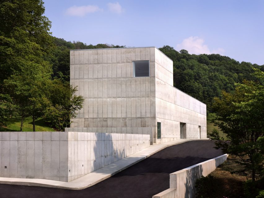
The pavilion is partially submerged into a sloping green hill, with entrances on either side of the building at the top and bottom of the grade.

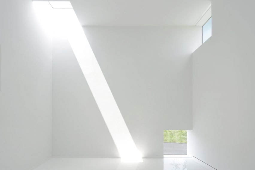
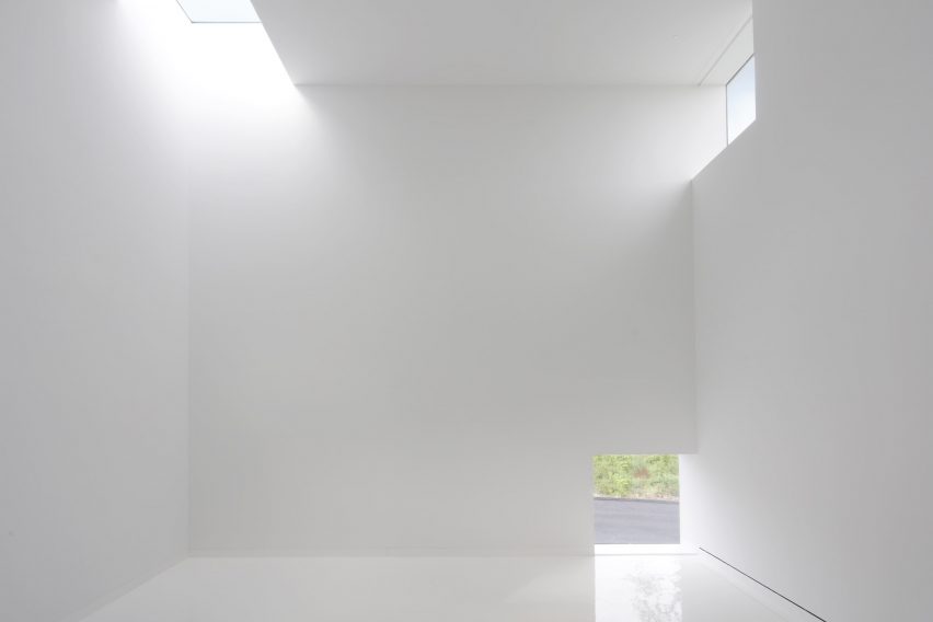
It has a monolithic concrete facade with little detail, punctuated at points by simple square windows. At the top of the hill, the structure has a vertical element that gives the whole building an L shape.

Within this space a double-height gallery was conceived of as an isotropic room that is a “perfect cube”, according to the architects. Windows were placed at each corner to create a sundial effect when light from outside enters.

White interior room with light streaming through square windows
The architects included a perfectly cubic room that functions like a sundial with strategically placed windows

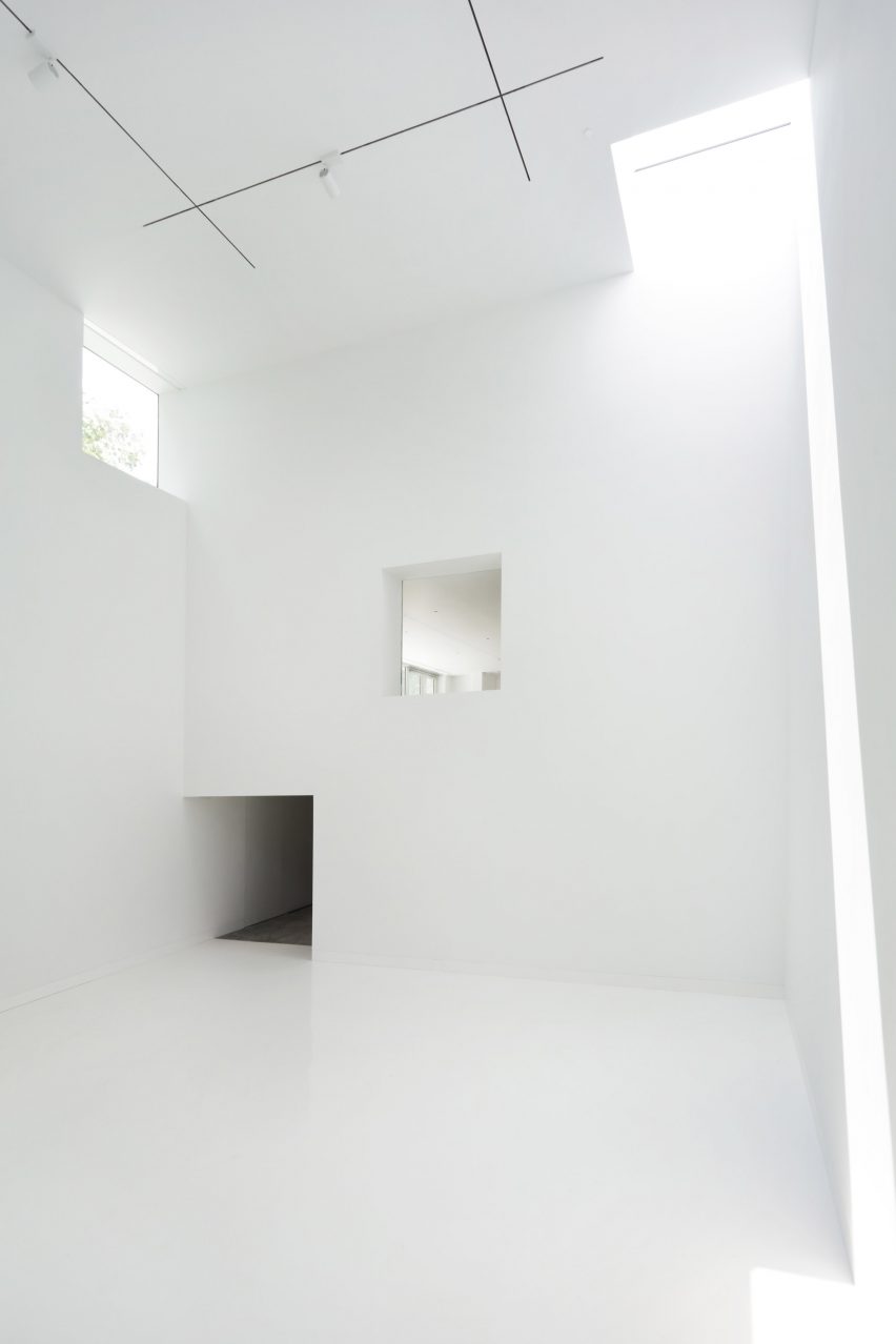
“We built the Robert Olnick Pavilion like a poem: a white cube traversed by light,” said Baeza.

“The main space will embody the beauty of the artwork it exhibits, and with an isotropic design that carves an opening into every corner, each detail will be touched by magnificent sunlight.”

“Not unlike the excitement of birth, it is with great anticipation that we deliver this second building to the museum.”

Polished concrete floors and white ceilings
The interior features polished concrete floors and white ceilings

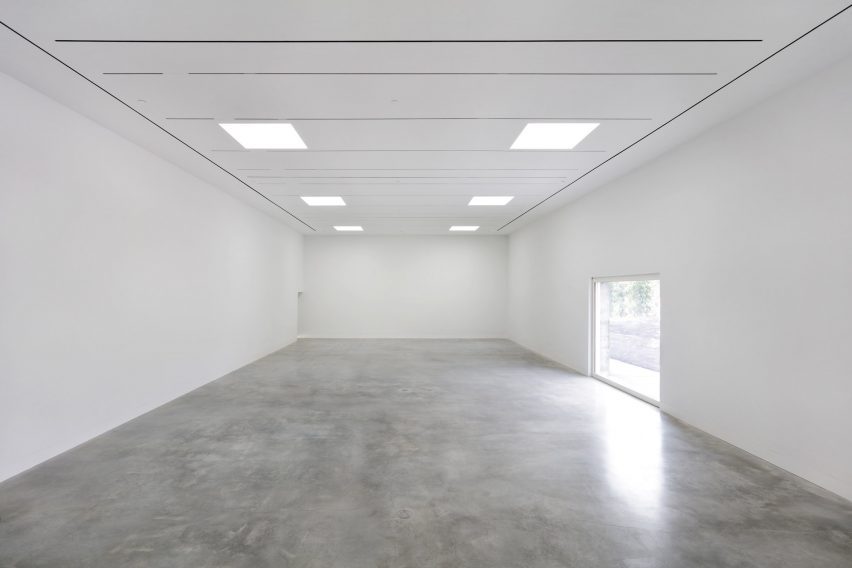
The building has two floors and a mezzanine, with a long first floor that stretches the length of the structure and holds a variety of programming spaces, terminating at a glass end wall that overlooks a sunken courtyard.

The primary floor holds the two main galleries, one in the long end of the building and another housed in the double-space element created by the vertical element at the top of the grade.

“The pavilion has a humble layout that highlights industrial materials such as concrete to facilitate a conceptually strong and aesthetically neutral environment to compliment the postwar and contemporary Italian art and design it will exhibit,” said the museum.

White room with beams of sunlight
The galleries will hold art by Italian creatives

Between the two gallery spaces is a mezzanine level that is accessed from the door at the top of the slope. This space holds a cafe with a seating area that extends outdoors.

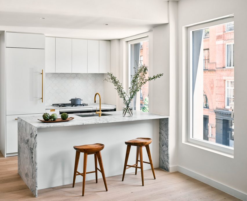
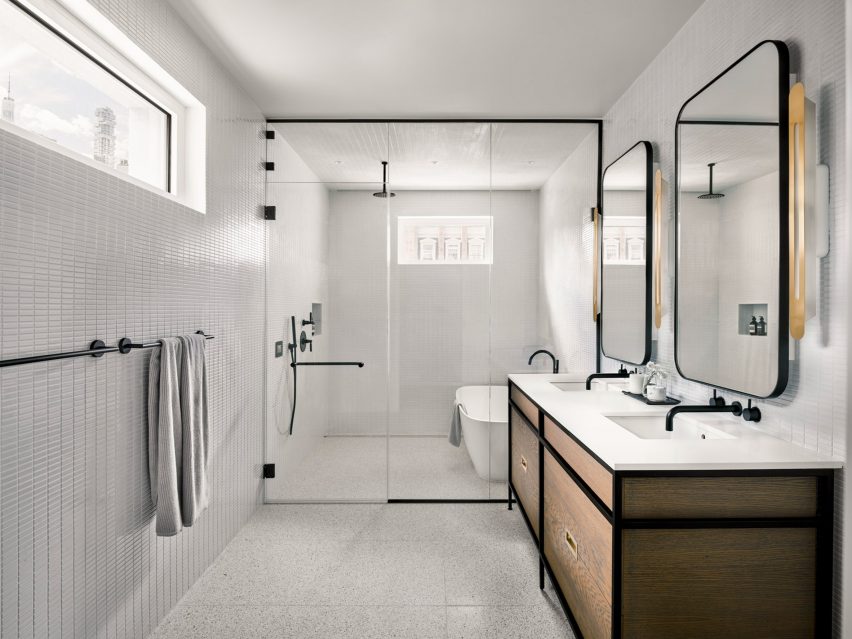
All the interiors are stark white, in line with the minimalism of the facade. Polished concrete flooring and seamless overhead lights were designed to add to the smoothness of the interior.

White light in white gallery space
The structure has two floors and a mezzanine

The museum plans to launch its first exhibitions in the fall, featuring the work of Italian designers and artists such as painter Mario Schifano and architect Carlo Scarpa.

Baeza and Quasimondo has been working with museum founders Nancy Olnick and Giorgio Spanu for more than twenty years, and designed the pair’s home, which was Baeza’s first US project, in 2003.

Other projects by Baeza include a sports complex in Madrid designed to be a “box of light” and a white-walled minimalist house in Monterrey, Mexico.

The photography is by Marco Anelli

Reference

adjaye associates 130 william
CategoriesArchitecture

adjaye associates’ first skyscraper evokes fortress ruin in new york

adjaye associates 130 william

now complete: new york’s modern ruin by adjaye associates


130 William stands completed in New York City‘s financial district, marking Adjaye Associates‘ first skyscraper. Designed as a rejection of the common glass tower, the architecture takes its inspiration from the industrial heritage of the city with its facade of rhythmic, arched windows and its hand-cast concrete skin — this way, the project evokes a ‘ruin’ in the city, proposing an alternative history of New York architecture. The building rises 800 feet and 66 stories above the city, and introduces 242 residences along with a luxurious collection of amenities and a welcoming public plaza at street-level. See designboom’s previous coverage here.

adjaye associates 130 williamimage © Ivane Katamashvili


a hand-cast concrete facade evokes the texture of lava rock


From the street, 130 William’s entrance plaza opens up as a lush public ‘pocket park,’ which Adjaye Associates designed as a quiet retreat from the density of the Financial District. This park is wrapped on three sides by the building’s custom hand-cast facade with its stack of arched windows. From here, visitors can observe the rich texture of the blackened concrete skin, cast to evoke the porous surface of lava rock, which is highlighted by refined bronze accents. The distinctive silhouette of large-scale arched windows are a reminder of the historic lofts that once defined the fabric of lower Manhattan.


This idea of making a ‘pocket park’ as an outdoor room for the city was the compelling part of the project for me,’ architect David Adjaye said during an opening celebration at 130 William.Making not just a condo but a piece of public infrastructure, a piece of the city, was really important.’

adjaye associates 130 william
image © Ivane Katamashvili


inside the airy residences


While Adjaye Associates designs its 130 William tower with a dark, fortress-like exterior, the team curated its interiors with a light and airy ambience. The 242 residences range from studios to four-bedroom units, and take shape with materials gathered from across the globe. With wide-plank white oak flooring and large, bronze-framed arched windows, the each residence is designed with open and spacious interiors and a meticulous attention to detail. The team at Adjaye Associates custom-designed all the residences’ burnished bronze fixtures and hardware — including all faucets, showerheads, accessories, and door handles — along with textiles and textural wallpaper.

adjaye associates 130 william
image © Ivane Katamashvili


sheltered loggias bring private outdoor space


Within the top ten floors of 130 William, Adjaye Associates fits the Penthouse and Loggia Residences, which feature spacious rooms and high ceilings ranging from 11 to 14 feet. These interiors seamlessly connect to expansive outdoor areas with breathtaking views. The Loggia terraces envelop these residences from one end to the other, offering substantial outdoor space starting at a height of over 600 feet. These distinctive residences are further enriched with exclusive touches, such as sink countertops and soaking tubs crafted from exquisite marble.

adjaye associates 130 william
a ‘pocket park’ is open for residents and the public alike | image © Dror Baldinger


the luxury amenities of 130 william


130 William presents an extensive range of lifestyle and wellness amenities spanning over 20,000 square feet. These offerings encompass a comprehensive health and wellness club featuring a luxurious infinity-edge spa pool, invigorating cold and hot plunge pools, a rejuvenating dry sauna, and tranquil massage rooms. Additionally, there is a cutting-edge fitness center with a terrace, a serene yoga studio, and a versatile basketball court. Residents can indulge in various entertainment facilities, including a private IMAX theater, one of just two in all of New York City. Indoor and outdoor lounges offer a chef’s catering kitchen, a club room, a golf simulator, and a children’s play space. 

adjaye associates 130 william
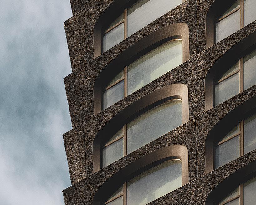
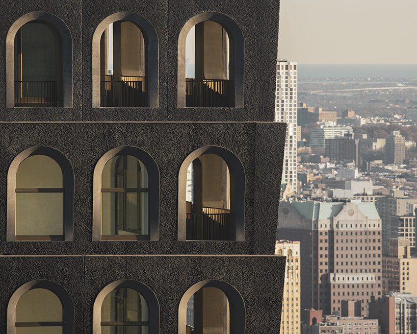
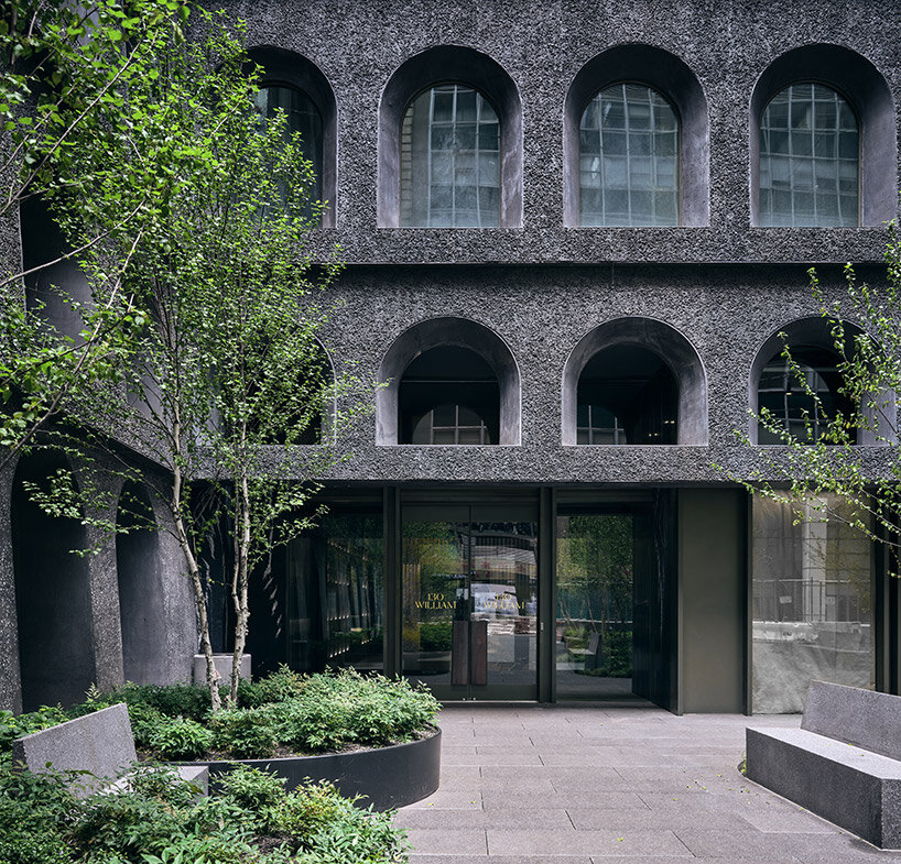
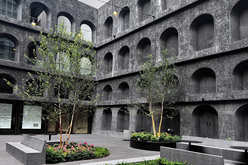
the blackened, textural facade wraps the public park on three sides | image © designboom


For panoramic views across the city and beyond, a private rooftop observation deck crowns 130 William, situated almost 800 feet above ground level. Convenient services include a 24-hour attended lobby, a concierge service catering to personal needs such as reservations and theater tickets, as well as a pet spa. Additional amenities comprise bicycle storage, private storage options, and exclusive rooftop cabanas.

Reference

alt=
CategoriesArchitecture

Infrastructuring Nature: Appropriating the Industrial Ruins of New York City

alt=

Architizer’s new image-heavy daily newsletter, The Plug, is easy on the eyes, giving readers a quick jolt of inspiration to supercharge their days. Plug in to the latest design discussions by subscribing. 

In his essay Nature, Infrastructure and Cities, Antoine Picon writes, “Before the rise of the environmental crises we now face, nature served as the support for infrastructures. Roads, bridges and canals were generally located in natural settings. However, in our contemporary technologically driven world, nature increasingly appears as a fragile entity that is itself in need of infrastructure support.”

New York has been the melting pot for architectural experimentation and innovation as well as the home to many industrial settings and infrastructures that are no longer operative. This, along with the more environmentally conscious approach architects are enforcing, has led to the appropriation of many of these settings fused with natural elements. These seven architectural projects showcase new, intuitive ways of “infrastructuring nature” by repurposing old industrial systems to create a “greener” New York City. As Antoine Picon points out, nature will never be prevalent in current metropolitan cities, nor will it be sustainable without artificial support. Nevertheless, the damage of overdevelopment is not irreversible as long as there are projects that recognize the hidden opportunities of these forgotten industrial ruins.


High Line

By James Corner Field Operations & Diller Scofidio + Renfro, Manhattan, New York, United States

Jury Winner, 2014, A+Awards, Concepts – Architecture + Light

alt=

alt=
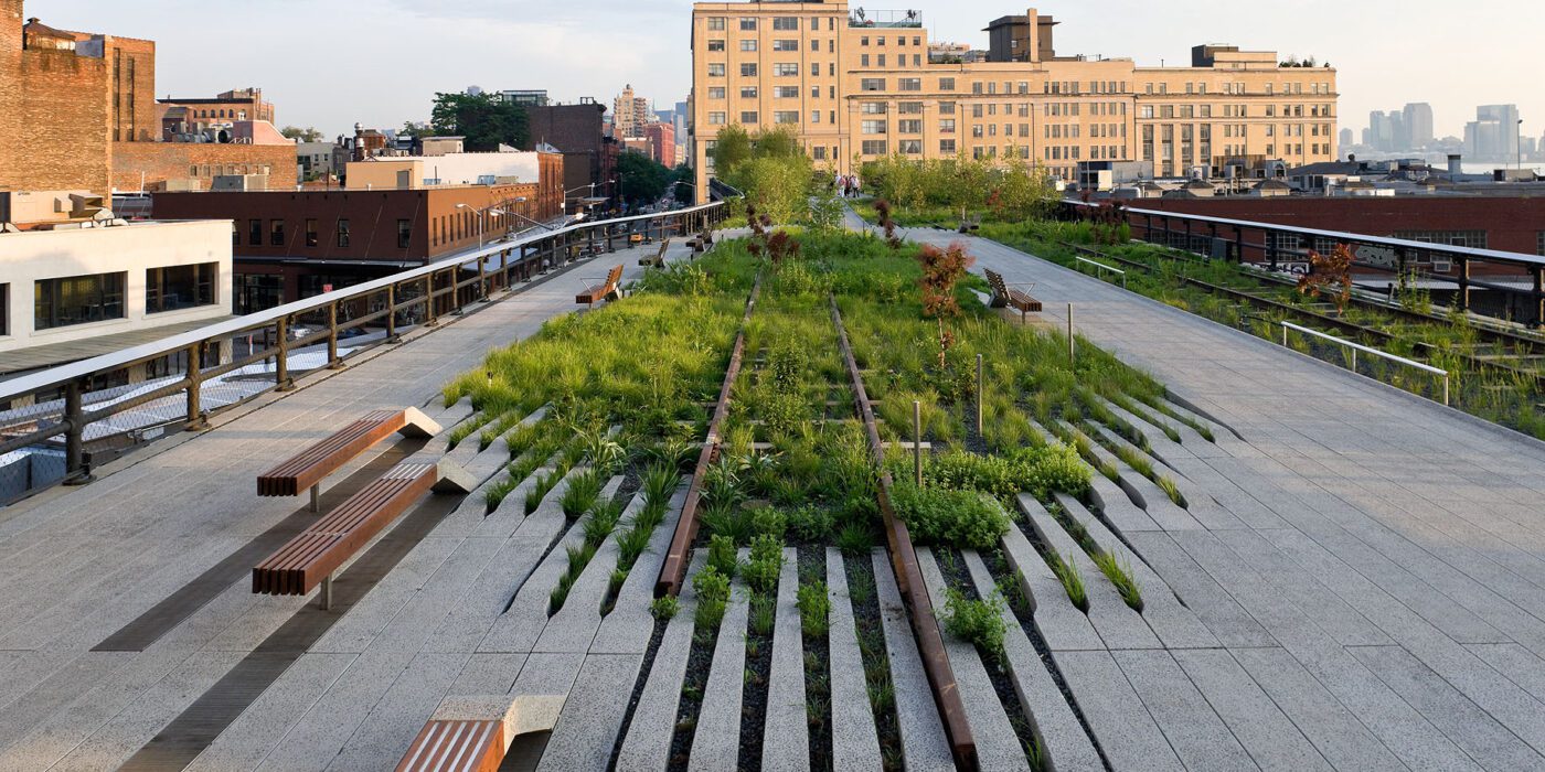
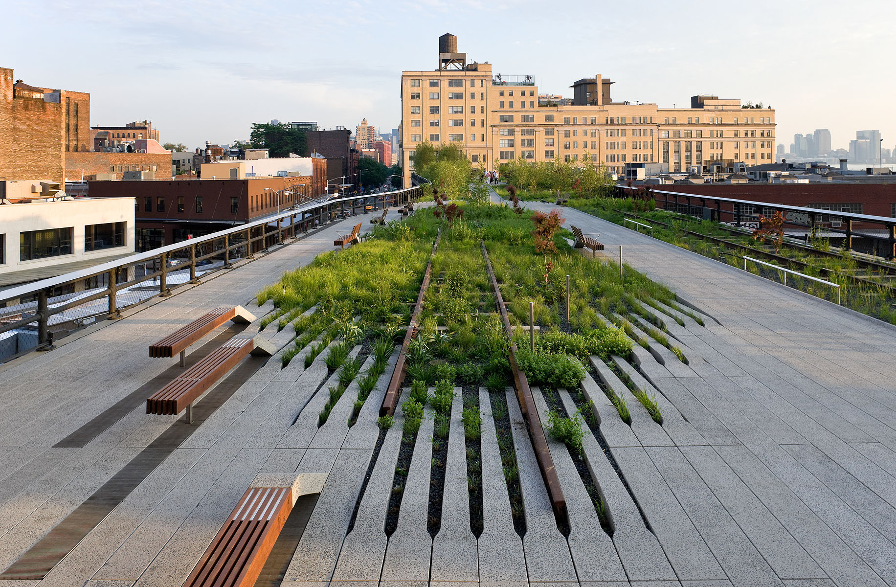
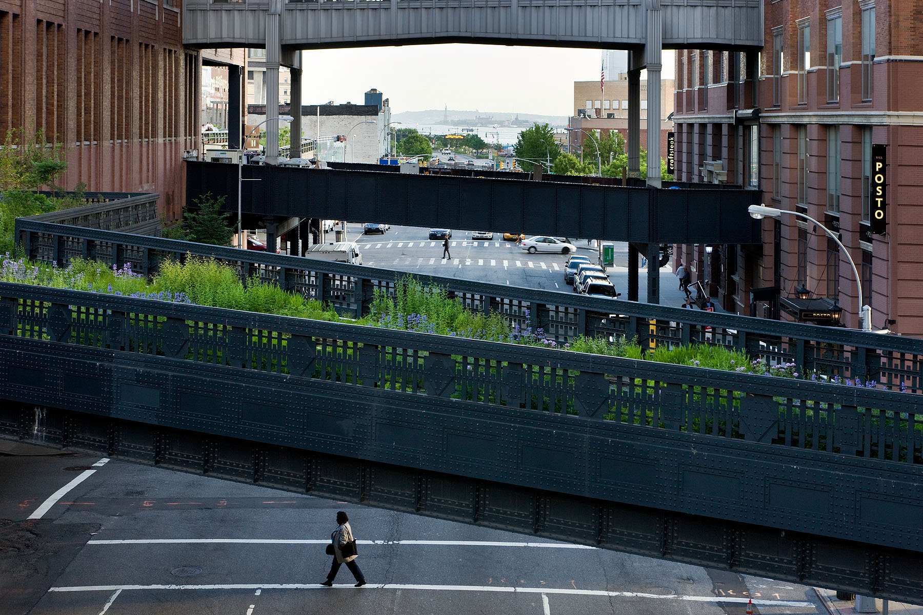
How can an abandoned railroad be reused by the citizens of New York City? Connecting the Meatpacking District with the Hudson Railyards, 1.5 miles (2.5 kilometers) of elevated rail tracks have been transformed into the High Line project: a public park that stands as an agricultural oasis amidst the franticness of the big city. Prior to the project’s realisation, the deserted railroad had already been “reclaimed” by nature. Consequently, when James Corner Field Operations and Diller Scofidio + Renfro designed the High Line they celebrated these natural diversities, by employing the strategy of “agri-tecture”. Irregular paving patterns and planting beds form a series of asymmetrical pathways, allowing the people of New York to experience the city through a different, more impromptu, type of lens.


Terminal Warehouse

By COOKFOX Architects, Manhattan, New York, United States

alt= alt=
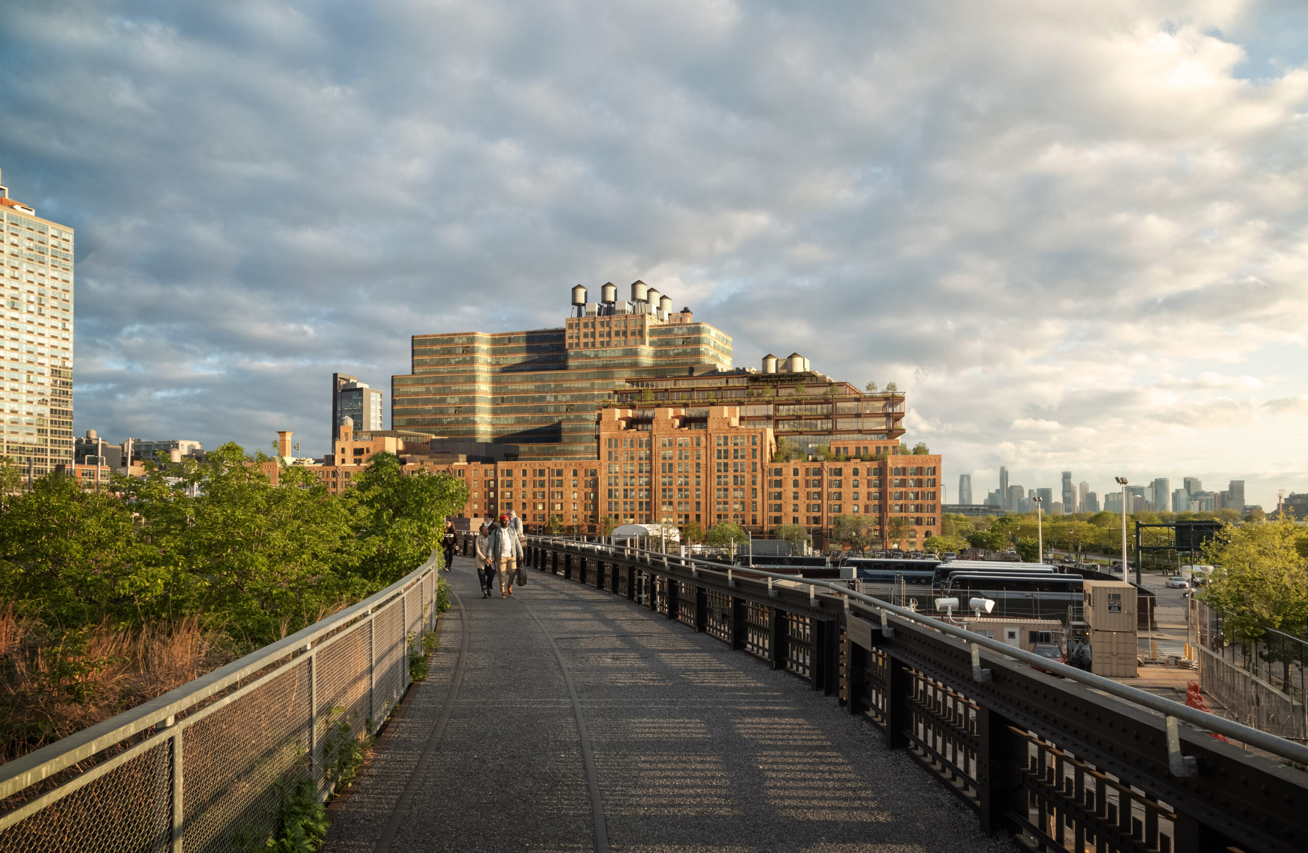
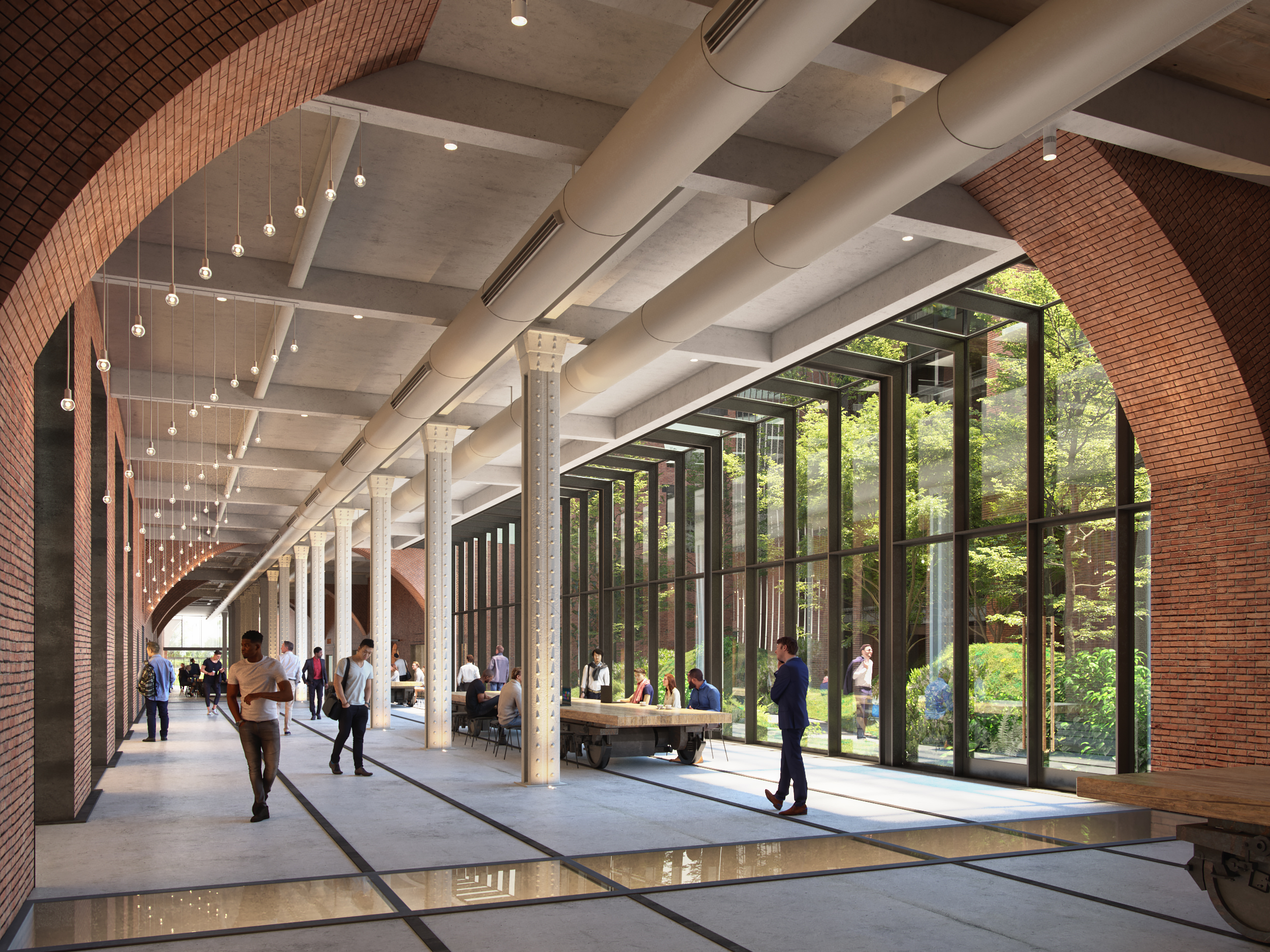
Built in 1891, the Terminal Warehouse is an iconic post-industrial ruin of New York. No longer needing the traditional warehouse in West Chelsea district, the Terminal Warehouse is gradually being transformed into a collection of biophilic office spaces. As part of their design strategy, COOKFOX Architects have preserved the building’s historic architectural typology and used its masonry structure as an infrastructure for supporting a series of gardens and green terraces. Additionally, through a set of rail tracks, the Terminal Warehouse is directly linked with Hudson river. The disregarded railroad becomes an opportunity for reuse and is transformed into a pedestrian route that reestablishes the link between city and water.


Governors Island Park and Public Space

By West 8, Manhattan, New York, United States

Jury Winner, 2017, A+Awards, Public Park
alt=

Photo by Iwan Baan

alt=

Photo by Noah Devereaux

Infrastructure comes in all shapes and sizes. The Governors Island, located south of Manhattan, is a piece of land that has been repurposed countless times. From an unspoiled landscape to a military base to a hotel and racetrack, the island was expanded through artificial means to host a number of contradicting functions. Finally, in 2006, West 8 won the competition for creating a masterplan that transforms the island into a public destination and landmark. They designed a historic park, a plethora of public spaces and a large promenade that wraps around the island. Nowadays, Governors Island has formed a symbiotic relationship with the New York harbor, eventually becoming its natural extension.


F.R.E.D., Fostering Resilient Ecological Development

By Ennead Architects, Queens, New York, United States

Jury Winner, 2017, A+Awards, Unbuilt Masterplan

alt= alt=
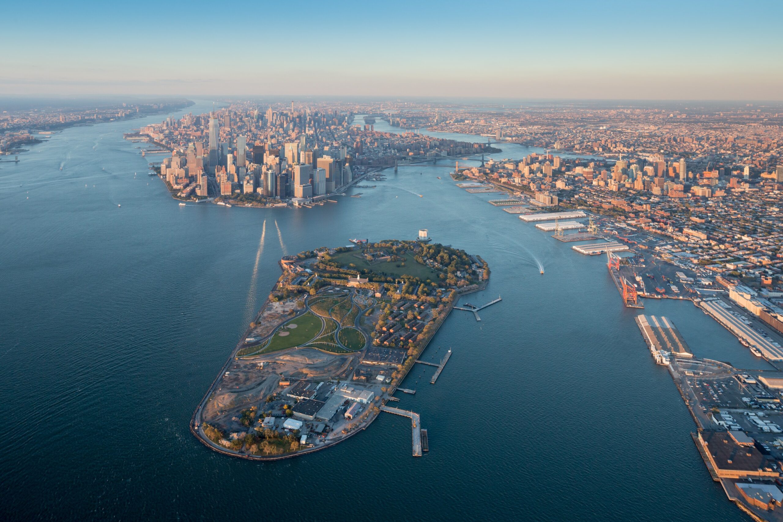
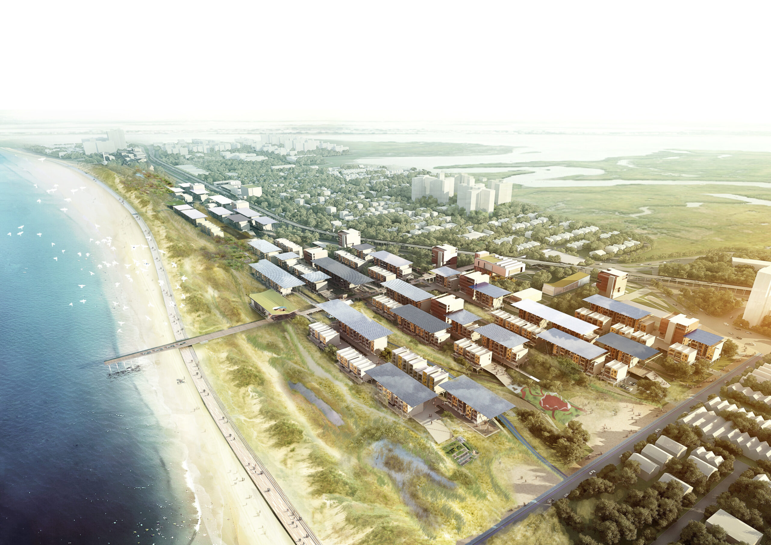
Located in a beach-front site in the Rockaways, the F.R.E.D. proposal introduces a new type of pairing between nature and infrastructure. Ennead Architects used the iconic Row House typology and the local sand dunes as the two components for designing a resilient infrastructure system. Their aim was to create a flexible strategy, which could be easily repurposed for other waterfront sites with the same characteristics and expand upon the research on “infrastructuring nature”.


Hunter’s Point South Waterfront Park

By SWA/Balsley & WEISS/MANFREDI Architecture/Landscape/Urbanism, Queens, New York, United States

alt="Hunter'sPoint-01" alt="Hunter'sPoint-02"
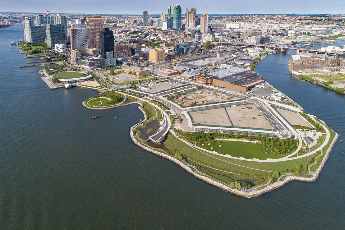
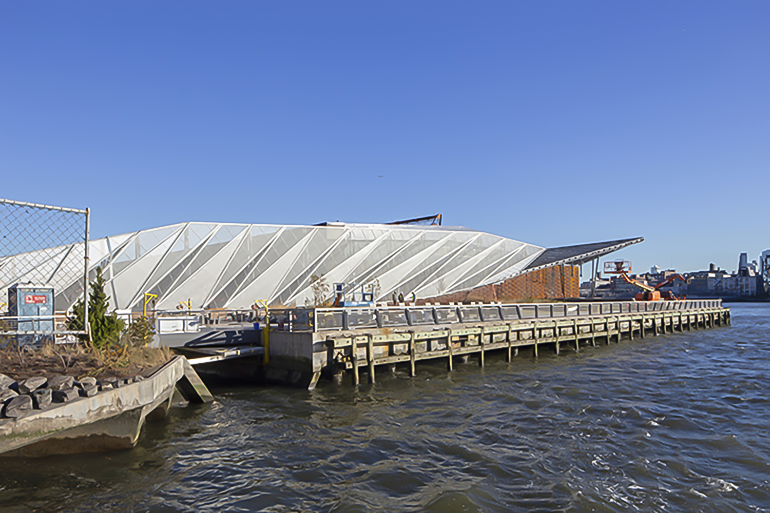
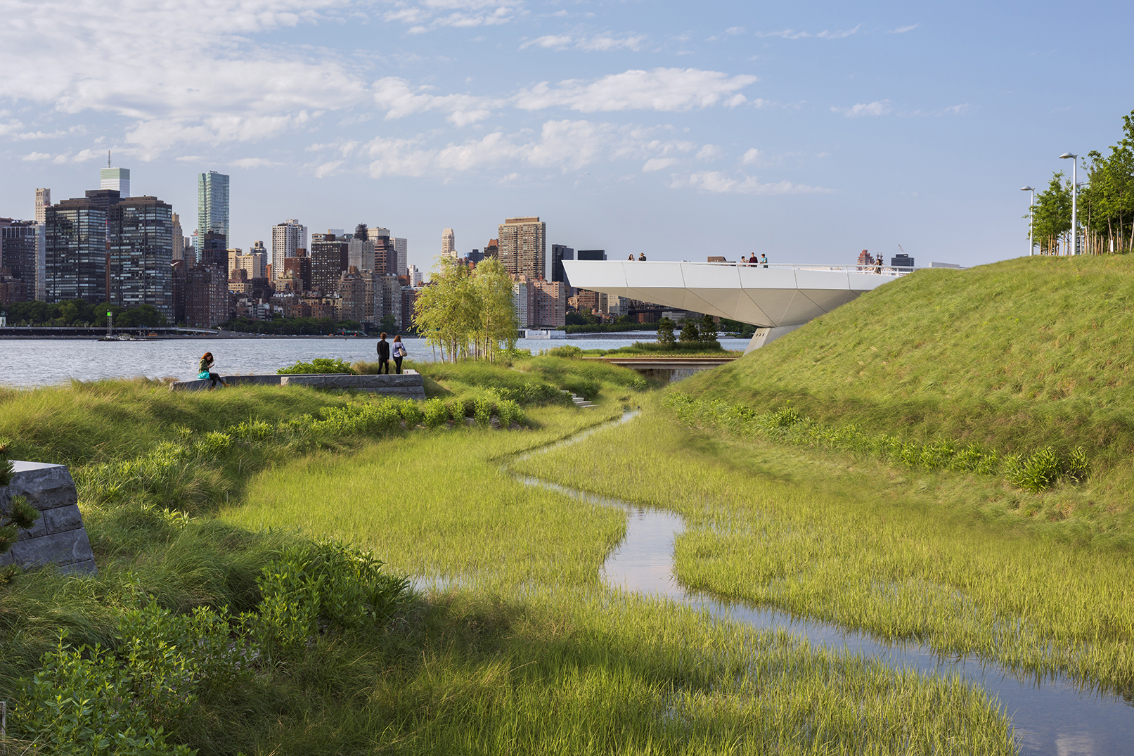
For two hundred years, Hunter’s Point was a series of wetlands on the East river. Later on, the site was turned into an industrial hub and rail station. Eventually, it was diminished to a post-industrial ruin filled with decaying piers and steep landfills, inaccessible to the wider public. Finally, in 2018 it became one of the most transformative and ecologically driven projects in the city. A coastal park, a footbridge, a cantilevered overlook and even a landfill peninsula transformed what used to be an empty industrial site into an adaptable infrastructural system that reinvented the once iconic water edge.


Pier 35

By SHoP Architects, Manhattan, New York, United States

alt= alt=
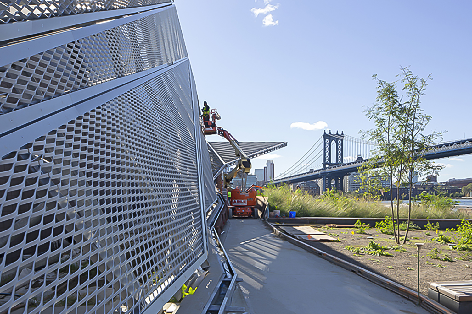
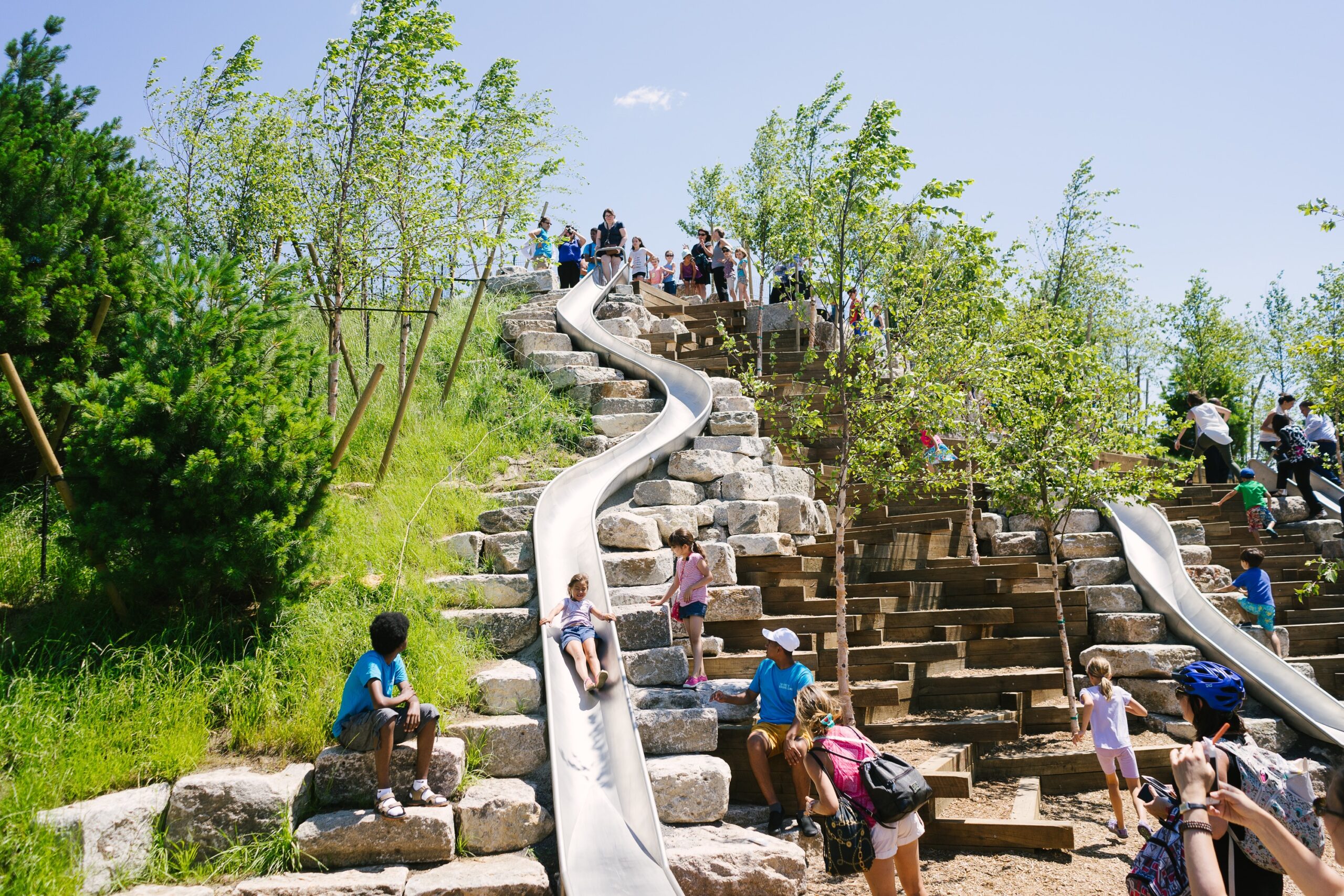
Enclosed by the Hudson and East rivers, the island of Manhattan is naturally surrounded by many raw, uninviting concrete piers. Fortunately, the Pier 35 proposal transformed one of these flat blocks of artificial land into a much needed esplanade project. Pier 35 is literary “infrastructuring nature”. It consists of a folded landscape that gradually slopes down to the surface of the water. Its crinkled form interacts with the varying tidal currents, while replicating the physical characteristics of the East river shoreline. Above the water, a series of landscape lawns, dunes and inclined plant-covered screens form pedestrian walkways filled with vantage points towards Brooklyn and Manhattan bridge.


The Dryline

By Rebuild by Design & BIG – Bjarke Ingels Group, Manhattan, New York, United States

Jury Winner, 2015, A+Awards, Masterplan

alt= alt=
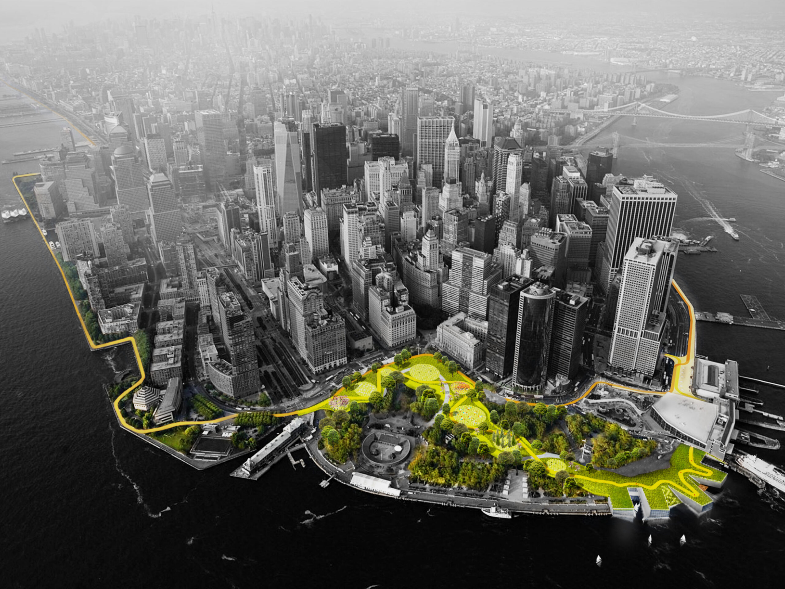
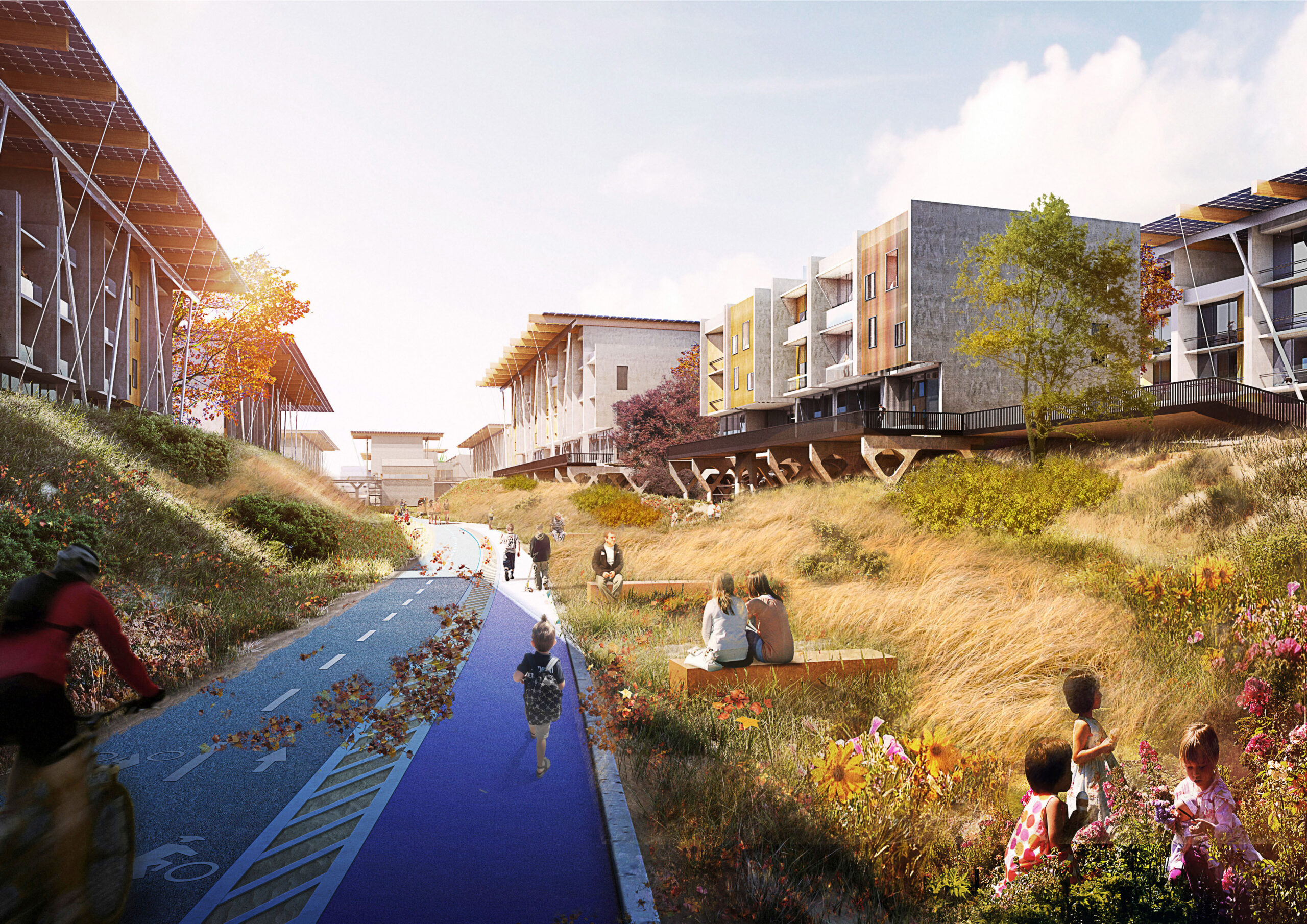
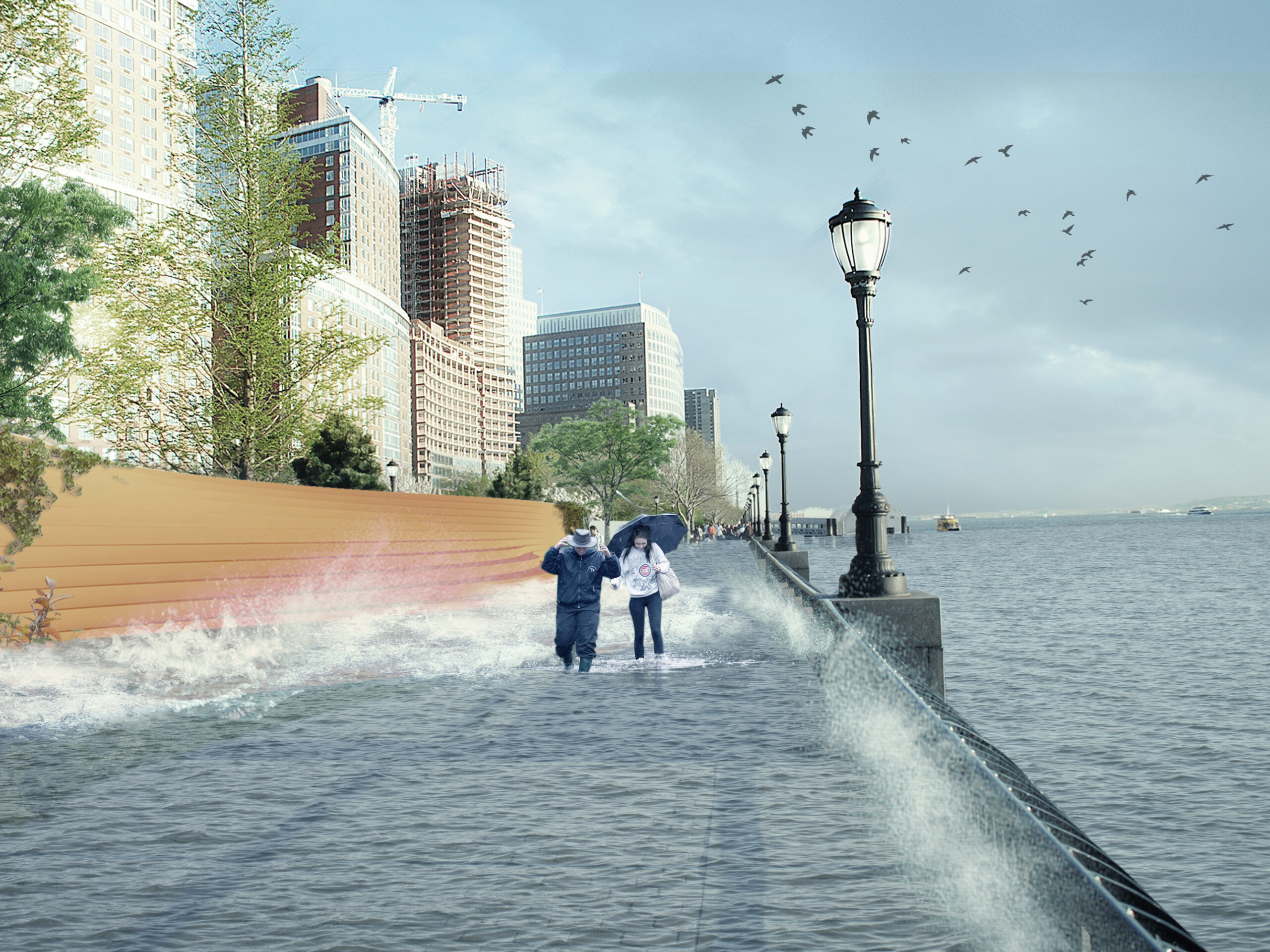
Also known as “The Big U,” this conceptual 10-mile-long (16 kilometer) protective ribbon around Manhattan was imagined in the wake of Superstorm Sandy. Ultimately, it was deemed unfit to respond to the challenging weather conditions that increasingly threaten the city. Subsequently, the Dryline is a project that redesigns lower Manhattan’s water edge, proposing a series of components that will aid to both the physical and social infrastructure requirements of the neighboring districts. More specifically, the project consist of a continuous protective element that also operates as playful street furniture, an elevated pathway and finally, a series of overarching greenways. In short, the Dryline project has essentially become the blueprint for effectively designing social as well as physical infrastructure strategies for coastal cities, providing new insights for “infra structuring nature” practices.

Architizer’s new image-heavy daily newsletter, The Plug, is easy on the eyes, giving readers a quick jolt of inspiration to supercharge their days. Plug in to the latest design discussions by subscribing. 

Reference

Rows of arched colonnades displaying garments on both sides of the store
CategoriesInterior Design

JUJU Studio creates flagship for Miss Circle in New York

Rows of arched colonnades displaying garments on both sides of the store

Pools of red carpet spill across the floor of this women’s fashion boutique designed by JUJU Studio in New York City.

For fashion brand Miss Circle, New York-based JUJU Studio created the interiors of its 2,600-square-foot (242-square-metre) store on West Broadway in SoHo.

Rows of arched colonnades displaying garments on both sides of the store
The Miss Circle flagship in occupies a long, narrow space designed by JUJU Studio

The space has a long, narrow footprint, so studio founder Jing Ju devised a variety of display techniques for the brand’s womenswear garments.

“Unlike typical fashion retail spaces, the Sensorial Flagship Store is inviting and relatable, encouraging customers to engage with the brand in a fully stimulating way,” said the studio.

Minimal sliding counter
At the front of the store, a sliding counter can be used for multiple purposes

The majority of surfaces are finished in beige plaster, providing a neutral backdrop for more dramatic moments.

These include areas where red carpet appears from the walls in fluid forms and spreads across the floor to look like pools of liquid.

Carpet on walls, floor and ceiling beside the entrance
Red carpet extends from the floor to the ceiling beside the entrance

“The smooth yet durable surfaces add texture and visual interest to the space, while the beige hue creates a sense of lightness and spaciousness,” the studio said.

“This helps to create an accommodating atmosphere in the closed retail environment, where customers are likely to take their time browsing through the store’s selection of clothing and accessories.”

Ribbed red seating and carpet on the wall
Matching the carpet is a curvaceous red sofa

At the front of the store, carpet also extends up the wall behind a curvaceous sofa of the same colour and seeps onto the ceiling.

A sliding counter can be used for checking in guests during events, or for displaying accessories at other times.

View of the store from the front
Garments are displayed in niches formed by arched colonnades on either side of the store

“The sleek and minimalistic design of the counter complements the overall aesthetic of the store and demonstrates a thoughtful and efficient use of space,” said the studio.

Along both sides of the store are arched colonnades, with cove-lit niches that each display a selection of clothing designs.

More outfits are presented on chrome railings and mannequins in the centre of this double-height space, above which a long skylight is positioned.

Towards the back of the boutique is a carpeted staircase that leads up to a mezzanine level, where the fitting rooms are located.

Red furniture in the fitting room area
Fitting rooms and a lounge area for customers is located upstairs

Red satin furniture, designed by Thehighkey, forms a seating area for customers to relax beneath another skylight, while plenty of mirrors are provided for those trying on garments.

“The warm lighting adds to the overall golden atmosphere, and the use of red provides a poetic and romantic sensation, making for a truly captivating experience,” the studio said.

Store exterior on West Broadway
The Miss Circle store is on West Broadway in SoHo

SoHo is renowned as a shopping destination for both fashion and furniture, and new stores are always appearing in the neighbourhood.

Recent openings include a Khaite flagship with a tree planted in the centre, an outpost for Road to Awe that includes red fitting rooms and a lofty Moroso showroom.

The photography is by David Luo and Justin Missner.

Reference

Reception area at the PatBo New York showroom
CategoriesInterior Design

BoND creates New York “embassy” for fashion brand PatBo

Reception area at the PatBo New York showroom

Architecture studio BoND has designed the New York headquarters for Brazilian fashion brand PatBo, which features pink scaffolding and rugs based on drawings by Roberto Burle Marx.

The office and showroom for PatBo occupies a 7,000-square-foot (650-square-metre) loft, which spans the entire seventh floor of a historic building on Fifth Avenue.

Reception area at the PatBo New York showroom
The PatBo showroom is located in a light-filled loft in New York’s Flatiron District

As the brand’s global headquarters, this space serves multiple purposes: showcasing the brand’s apparel; providing office space for staff; hosting buyers and events.

“Our biggest challenge was to divide the space according to the showroom’s new program while keeping its loft-like openness,” said BoND co-founder Noam Dvir.

Pink scaffolding used as clothes trails
To divide the open space, BoND used pink-painted scaffolding that doubles as clothing rails

To create partitions that double as displays, the designers chose scaffolding elements on which clothing can be hung and shelving can be installed.

“They are so readily available, so New York in their character, and very easy to adapt to different conditions,” said Daniel Rauchwerger, BoND’s other co-founder. “Moreover, they’re inexpensive and have a younger, fresher feel that works so well with the spirit of a PatBo studio.”

The showroom also serves as an office space
The showroom also serves as an office space for the PatBo team

Scaffolding has been used in a variety of retail environments for its versatility and ease of installation, including a bright yellow Calvin Klein store transformed by Raf Simons and Sterling Ruby, and a boutique for Wardrobe NYC designed by Jordana Maisie.

Painted pale pink in the PatBo showroom, the industrial scaffolding takes on a more feminine appearance, which sets the tone for the rest of the showroom.

Pleated pendant lights hang above a long table
Feminine touches like pleated pendant lights align with the brand’s aesthetic

Curved couches, pleated pendant lamps and tambour panelling all add to the soft aesthetic and further align with PatBo’s brand expression.

Circular fitting rooms surrounded by curtains allow clients to try on the colourful clothing in the main showrooom.

Tambour panelling is installed in private offices
Private offices feature tambour panelling and a mix of furniture

A second showroom area for hosting buyer appointments and casting calls includes minimal clothing racks with brass rails and oak frames.

This space is closed off from the reception, but still visible through large glass panels that allow light from the exterior windows to pass through.

The loft space overlooks Fifth Avenue
The historic building overlooks Fifth Avenue

Private offices along the far side of the loft also feature glass doors for the same purpose, and add to the feeling of openness and transparency throughout the showroom.

“It’s not meant to be too precious or delicate, but rather a place where a group of creative professionals can feel encouraged to move things around and make it their own,” said Dvir.

Atop the wooden floors are rugs based on the drawings of Brazilian modernist and landscape architect Roberto Burle Marx, designed in collaboration with São Paulo-based Punto e Filo.

Colourful furniture and potted plants also contribute to the Brazilian vibe in the space, and complement PatBo’s vibrant garments.

Wooden chairs on top of a rug inspired by Roberto Burle Marx
Rugs throughout the space are based on the drawings of Brazilian modernist Roberto Burle Marx

At the back of the showroom is a bar area, featuring a pink stone counter with rounded corners, and a sink placed within a curved niche that has mirrored sides.

“This is a space that combines elements of office, retail, and hospitality,” said Rauchwerger. “With that, it is able to serve as a real embassy for PatBo as a brand.”

A bar area with pink stone counters
A bar area with pink stone counters is used for hosting events

Rauchwerger and Dvir, both former journalists, founded BoND in 2019 after working as architects at OMA, WeWork and more.

Their studio’s previous projects have included the renovation of a dark Chelsea apartment into a light-filled home.

The photography is by Blaine Davis.


Project credits:

Project team: Daniel Rauchwerger, Noam Dvir, Liza Tedeschi

Reference

Exterior of cast-iron building housing Canal Projects
CategoriesInterior Design

Worrell Yeung renovates cast-iron New York building for Canal Projects

Exterior of cast-iron building housing Canal Projects

Architecture studio Worrell Yeung has renovated a historic cast-iron building in Soho for an arts organisation called Canal Projects, which hosts exhibitions “in an unmistakably New York City space”.

Sat between Soho and Tribeca, the five-storey landmark was built in 1900 as a manufacturing centre, featuring a decorative white facade, double-hung windows and an external fire escape all typical of the neighbourhood.

Exterior of cast-iron building housing Canal Projects
Worrell Yeung renovated the lower two floors of a landmarked building to create a home for Canal Projects

Its street and basement levels were renovated by Worrell Yeung to create a home for Canal Projects, a non-profit arts organisation that hosts exhibitions, talks, performances, readings and screenings for the community.

The studio was careful to retain as much of the building’s character as possible, highlighting the existing features like original masonry and steam radiators, and restoring them where necessary.

Patinated bronze panels line the entry threshold
Patinated bronze panels line the new entry threshold

Visitors arrive via a new entry threshold on Canal Street, where patinated bronze panels line the tall walls in a space intended to offer a moment of pause.

Up a short flight of steps is the main gallery space – a large, open and flexible room that can be programmed in accordance with the organisation’s needs.

The main gallery space is surrounded by windows and features historic details

“We designed the foundation to be a series of spaces that would compress and expand, collapse and unfold and move between dark and light,” said Worrell Yeung co-founder Jejon Yeung.

Surrounded by 14 large windows on two sides and boasting ceilings over 13 feet (four metres) tall, this room is light-filled and spacious.

A staircase leads down to more space at cellar level

New white oak floors complement the industrial details, including five cast iron columns and five wide flange steel columns that were exposed and restored.

“Similarly to providing artists with a distinctive platform, we wanted viewers to experience art in an unmistakably New York City space,” said Max Worrell, Worrell Yeung’s other co-founder.

Library space with pivoting shelves
A library area is formed by pivoting floor-to-ceiling shelves

“Passers-by will glimpse exhibitions from the street through the window walls along Canal and Wooster Streets, and visitors on the interior can see artwork with the city context visible in the background,” Worrell said.

Also on the ground-floor level are private offices for the curators and a bright orange public restroom.

The dark cellar space is used for film screenings

Next to a freestanding reception desk by artist Zachary Tuabe, a staircase leads down to the basement level, which has a much smaller occupiable footprint.

Darker and more enclosed, the cellar space features original brickwork, masonry and timber ceiling joists, and provides a very different exhibition space that is suitable for film screenings.

Orange kitchen
A bright orange kitchen is tucked into an alcove

Light from the steel sidewalk grates illuminates one end of the space, where a library area is created by floor-to-ceiling shelving that pivots as required.

A pantry area is hidden in an alcove behind a set of stable doors and is coloured entirely bright orange to match the upstairs restroom.

“We wanted artists to confront a venue that provides sufficient neutrality for their work, but that is also distinctly undivorceable from the Soho Cast Iron District,” said Yeung.

“This is a building typology unique to New York City, and a richly layered context within which to exhibit.”

Orange public bathroom
A public restroom on the upper level matches the kitchen

Canal Projects opened to the public in September 2022, with an exhibition titled Pray organised by artistic director and senior curator Summer Guthery.

The show featured works by Bangkok and New York-based artist Korakrit Arunanondchai, and American artist and filmmaker Alex Gvojic.

The Canal Projects building exterior at night
The building is located on the corner of Canal and Wooster Street, between Soho and Tribeca

Worrell Yeung was founded in 2015, and has worked on a variety of projects in and around New York.

The studio recently completed a timber-clad lake house with cantilevered roof planes in Connecticut, while past endeavours have included a Hamptons renovation, a Chelsea loft apartment, and the penthouse in the Dumbo Clocktower Building.

The photography is by Naho Kubota.


Project credits:

Architecture and interior design: Worrell Yeung
Worrell Yeung project team: Max Worrell, founder and principal; Jejon Yeung, founder and principal; Beatriz de Uña Bóveda, project manager; Yunchao Le, project designer
Structural engineer: Silman (Geoff Smith, Nick Lancellotti)
Lighting designer: Lighting Workshop (Doug Russell, Steven Espinoza)
MEP engineer: Jack Green Associates (Larry Green)
Expediter/code consultant: Anzalone Architecture (James Anzalone)
Contractor: Hugo Construction (Hugo Cheng, Kong Leong)

Reference

Exterior of the red-brick Grand Mulburry building by Morris Adjmi with a textured facade
CategoriesArchitecture

Morris Adjmi designs Grand Mulberry building to evoke historic New York

Exterior of the red-brick Grand Mulburry building by Morris Adjmi with a textured facade

US architect Morris Adjmi took cues from tenements that once housed Italian immigrants to create a new mixed-use building with a decorative brickwork facade.

Rising seven storeys, Grand Mulberry is located on a storied site in Manhattan’s Little Italy neighborhood.

Exterior of the red-brick Grand Mulburry building by Morris Adjmi with a textured facade
The seven-storey building was informed by New York tenements

To design the new building, architect Morris Adjmi – who leads an eponymous local studio – took cues from the area’s history and architecture, including its tenement buildings dating to the 19th and early 20th centuries.

For the street-facing elevations, the architect designed a rounded corner and a grid of rectangular, punched windows surrounded by red-orange bricks. A distinctive “Morse code-like” pattern was created using bricks with domed extrusions.

Exterior of the red-brick Grand Mulburry building by Morris Adjmi with a textured facade on a street corner in New York City
The building has a rounded corner and a grid of rectangular windows

The domed bricks are arranged in a way that evokes the tripartite facade of a building that once stood on the site, making it a “ghost of the past building”, said Adjmi.

The ground level contains space for retail and a new home for the Italian American Museum, slated to open in 2024. The upper portion of the building holds a total of 20 condominiums.

Exterior of the red-brick Grand Mulburry building by Morris Adjmi with a textured facade
The exterior is covered with domed brickwork

“Given the project’s setting, the objective from the onset was to design a building that was contextual yet unmistakably contemporary,” the firm said.

“With a nod to the traditional Italianate tenement embedded in its bones, Grand Mulberry is a brand-new building that does not completely erase the site’s history and that doesn’t necessarily make passersby mourn for the New York that was.”

Exterior of the red-brick Grand Mulburry building by Morris Adjmi with a textured facade
The domed bricks were arranged in a pattern that references a building that previously occupied the site

At the base of the building, the ornamental bricks – hand-moulded by Glen-Gery– form horizontal bands. At the middle and top levels, they are arranged to evoke pediment windows and arched widows, respectively.

“Looking carefully, one can see the mark of the traditional tripartite façade that consisted of a base, a middle and top layers, with differing details and brickwork used for each portion,” the architect said.

“At the same time, the bricks’ path and dimensionality create a visual texture that adds energy to the block, building on Little Italy’s distinct flavour.”

The rear elevations are faced with a combination of metal panels, concrete and bricks.

The building is topped with a cluster of volumes that is set back from the streetwall and wrapped in light grey cladding.

Within the building, the team drew upon traditional materials and techniques, the architect said.

Interior of a kitchen with wood flooring, white kitchen units and a white marble island
Traditional materials were used in the interior

In the lobby, one finds black-and-white, mosaic-style flooring and plaster finishes. The residential units feature wooden flooring, marble countertops and decorative tile backsplashes.

Overall, the building “encapsulates traces from historical architecture while engaging with the neighbourhood”, the architect said.

Interior of a white bathroom with a walk-in wet room and wooden vanity units
Grand Mulberry contains retail space and apartments

The building is named after its location on the corner of Grand and Mulberry streets – a site once occupied by brownstones that partly dated to the 1830s.

The site was famous for housing a bank that operated from 1882 to 1932 and was used by Italian immigrants.

Domed brickwork on the exterior of the Grand Mulburry building by Morris Adjmi
Bricks with domed extrusions decoration the exterior facades

Born in New Orleans, Morris Adjmi began his career working with the Italian architect Aldo Rossi in the 1980s. After Rossi’s death in 1997, Adjmi established Morris Adjmi Architects in New York. The studio also has an office in New Orleans.

Its other projects include a 25-storey, glass-and-steel tower in Philadelphia that contains apartments and a hotel.

The photography is by Morris Adjmi Architects.

Reference

Climate tile_close up
CategoriesArchitecture

Extending Manhattan Is Not Going to Save New York From Flooding

Climate tile_close up

Browse the Architizer Jobs Board and apply for architecture and design positions at some of the world’s best firms. Click here to sign up for our Jobs Newsletter.

Global warming has increased volatile weather and is causing sea levels to rise at alarming rates. Combined, these two problems are making coastal regions increasingly vulnerable. Covered in asphalt, concrete and other hard surfaces, cities are already at a disadvantage due to their low porosity. Surface runoff relies heavily on the sewerage system; a very limited amount of water can get away through evaporation.

Unlike more natural or rural areas, where sand and soil can let surface runoff go underground, in cities, water can usually only go down in places where a manhole connected to the city’s sewage system is available. Under such circumstances, water is more likely to accumulate, overwhelming the sewerage system and causing flooding as it takes longer to get back to the underground water system or nearby tributaries. Manhattan is particularly vulnerable.

After Hurricane Sandy hit New York City in 2012, the city was left mourning the deaths of 43 people and assessing damage totalling $19 billion. More recently in 2021, Hurricane Ida devastated NYC. Hurricane, surge and flooding are the problems that the city has to deal with urgently. In January, Professor Jason Barr from Rutgers University proposed a divisive solution aimed to combat future flooding: extending Manhattan. The extension scheme is also to tackle the housing issue of the crowded island.

As proposed by Prof. Barr, the extension scheme by the south of the island is about 1,760 acres large. It runs approximately from Holland Tunnel to somewhere around Manhattan Bridge and extend beyond the Statue of Liberty towards the south. The extension seeks to provide about 180,000 housing units for 247,000 people in total. Constructed wetlands will stand between land and water to protect the city behind it from flooding.

Indeed, constructed wetlands have been proved to be environmentally beneficial and mitigate floods. Soil and plants hold the water when it comes and allow it to penetrate the ground while holding them. Compared to an unobstructed urban hard surface where water can run over immediately, constructed wetlands reduce the intensity of peak flow when flooding.

Furthermore, as they are connected to the sewerage, constructed wetlands function as biofilters for treating rainwater/storm runoff and urban grey water. The plants remove nutrients, heavy metals and other pollutants from the water. The filter bed, which normally consists of sand and gravels, also help remove solid contaminants. If well-planned, constructed wetlands can as well be a pleasant part of the urban landscape, adding to the biological diversity in cities.

Climate tile_close up

The Climate Tiles installed by Heimdalsgade 22-24, Nørrebro, Copenhagen ©Tredje Natur.

Climate tile_drawing

Drawings of the Climate Tiles ©Tredje Natur.

Here comes the question: how large do the constructed marshlands and wetlands need to be on the extension to save Manhattan from damages and losses in future? According to a study after Hurricane Sandy which looked at coastal wetlands’ efficiency in flood/damage reducing, the wetlands covering only 2% of New York State’s land area have saved about $140 million or 0.4% of the state’s total losses.

Looking at the rough plan created by Prof. Barr, it is clear that more careful considerations are needed when planning enough artificial wetlands for protecting the entire Manhattan. Besides, the shown plan is making the East River even narrower, which could reduce its capacity.

There are other urban design strategies to cope with water. The Climate Tile project by Tredje Natur is reintroducing the hydrologic cycle to the city of Copenhagen. The visible part of the project is pavement tiles with small wholes on them that allow water to infiltrate into the ground and down to the sewerage. It is mimicking the natural process where surface runoff joins the groundwater through infiltrating the soil.

An invisible component of the project lies beneath the tiles, where the main part of the artificial water system functions. The rainwater collected from rooftops and the street level gathers through pipes. Connected to the soil under urban green areas, the water collected is then supplied to plants. The excess goes into the city’s drainage system after part of the water and nutrients are consumed by plants. This scheme can let water into the ground faster rather than completely relying on storm drains. By feeding water to plants first, it also controls the amount of water going into the main sewerage.

Cheonggyecheon_day

The restored Cheonggyecheon River, photo by Isageum on Flickr, accessed from Wikimedia Commons.

Cheonggeycheon_night

The restored Cheonggyecheon River, photo provided by Cheonggyecheon official website.

While the Climate Tile requires careful corporations with the existing drainage system, the Cheonggyecheon River restoration project in Seoul, South Korea, took the “radical” route in giving the river back to the hydrologic system. The Cheonggyecheon River flowed underground for about 50 years before once again seeing the light of day in 2005. The river was nearly dry when the road and highway that run above it have been removed. Continuing for over three miles, the river banks became a linear urban green space as well as flood plains to hold the river’s overflow during heavy rains.

Flood plains for overflowing are not any kind of modern invention but the most natural way to deal with seasonal flooding. As we harden the land to build more towers, we are also sacrificing the capacity of water bodies around cities. Meanwhile, the sea level keeps rising, pushing our water system even closer to its limit. Cities then become vulnerable when regular or unexpected heavy precipitation comes, leaving tragedies behind. Keeping a respectful distance between the built environment and nature is our way out from the climatic crisis, rather than continuing invading.

Browse the Architizer Jobs Board and apply for architecture and design positions at some of the world’s best firms. Click here to sign up for our Jobs Newsletter.

Reference

Google Store windows
CategoriesInterior Design

Google store designed by by Reddymade opens in New York

Google Store windows

Google has opened its first physical retail space in New York’s Chelsea, designed by architecture studio Reddymade to include cork furniture and recycled materials.


Welcoming its first visitors on 17 June 2021, Google Store occupies a ground-floor space in the former Port Authority Building – a vast art deco structure that is home to the tech company’s NYC headquarters.

Google Store windows
The large windows of the first Google Store look out onto Ninth Avenue in Chelsea

Located on the corner of 15th Street and Ninth Avenue, the store’s glazed facade looks onto the entrance of the popular Chelsea Market situated opposite.

Architect Suchi Reddy of Reddymade worked with Ivy Ross, VP of design, UX and research for Google Hardware, to create a retail experience based on their collaboration during Milan’s Salone del Mobile in 2019.

Google Store interior
Google Store’s interior features warm materials and lighting

Elements of the exhibition, A Space For Being, including the core principles of neuroaesthetics – a branch of science that examines how visual aesthetics can impact our bodies and minds – informed the design of the store.

Warm and tactile materials like wood panelling, and cork furniture by Daniel Michalik, were chosen to create an inviting mood in the main area. “Reddymade’s design puts the visitor at ease, welcoming those seeking help alongside those pursuing their curiosity,” said a statement on behalf of the studio.

Seating in Google Store
Cork furniture by Daniel Michalik is dotted around the space

At the entrance, tubes of extruded glass are suspended between the floor and ceiling to form the Imagination Space, where visitors are invited to interact with Google products and technologies via a series of screens.

The intention is to “re-awaken visitors to the childlike wonder found in the technology and digital innovation on display”, the statement said.

Around the store, a thin black metal line traces a fluid path, drawing the eye between the various product displays.

A central circular counter that acts as a support desk has a neon halo, spelling out “Here to help” multiple times in a ring.

Casual seating at Google Store
Casual seating is provided for customers seeking product support

Casual seating in the form of benches, poufs and stools can be used by shoppers and those seeking product advice or assistance.

In the windows, illuminated “discovery boxes” showcase Google products and allow passersby to interact with them using augmented reality technology.

Imagination Space
The Imagination Space creates an enclosed area for shoppers to experience Google products and technologies

Many of the materials across the Google Store were selected for their sustainable credentials, enabling the project to achieve LEED Platinum certification.

Among these are flooring made from 100 per cent recycled factory waste by Swedish company Bolon, and acoustic panels with a felt-like finish made from 100 per cent PET plastic, and containing at least 60 per cent post-consumer content, by US manufacturer Kirei.

Window boxes from the exterior
Discovery Boxes in the Google Store windows allow passersby to interact using augmented reality technology

Ross spoke to Dezeen in 2019 about how companies like Google “have an obligation” to be more sustainable.

She is also responsible for the creation of the Google Design Lab at the company’s Silicon Valley headquarters, as well as the expansion of its hardware line, which she has overseen since 2016.

Photography is by Paul Warchol, courtesy of Google.


Project credits:

Architect: Reddymade
Contractor: Michilli
MEP engineer: Rosini Engineering
Structural engineer: Stratford Engineering
Accessibility and LEED consultant: Steven Winters Associates
Lighting designer: Reveal Design Group
Acoustic consultant: Lally Acoustical Consulting
Expeditor: Ganci & Logozzo
Millwork/fabricator: Bednark Studio
Millwork: Viridis
Glass fabricator (Magic Space): AMG Glass Technik
Cork furniture: Daniel Michalik
Furniture dealer: EvensonBest
Upholstery: The Work Room
Neon: Let There Be Neon

Reference